

Burning River Blues
Burning River Blues is a nonprofit blues dance organization based in Cleveland, Ohio, dedicated to fostering an inclusive community through social dancing, education, and live music. The organization hosts weekly dances, workshops, and special events that celebrate the rich history and culture of blues dance while welcoming dancers of all skill levels. By creating opportunities to learn, connect, and express themselves through movement, Burning River Blues preserves the traditions of blues dance and helps grow its vibrant local community.
Role: Graphic Designer, illustrator, client communication
Project Context: Non-Profit Organization
Product Type: Logo, Social Media Package
Duration: 4 weeks, Feb-March 2026
Tools: Figma, Procreate, Adobe Illustrator
Problem
Burning River Blues’ existing brand identity and website no longer reflected the organization's personality or resonated with its target audience. The visual identity lacked distinction and consistency, making it difficult to communicate the organization's bold, gritty character while establishing a memorable brand presence.
Solution
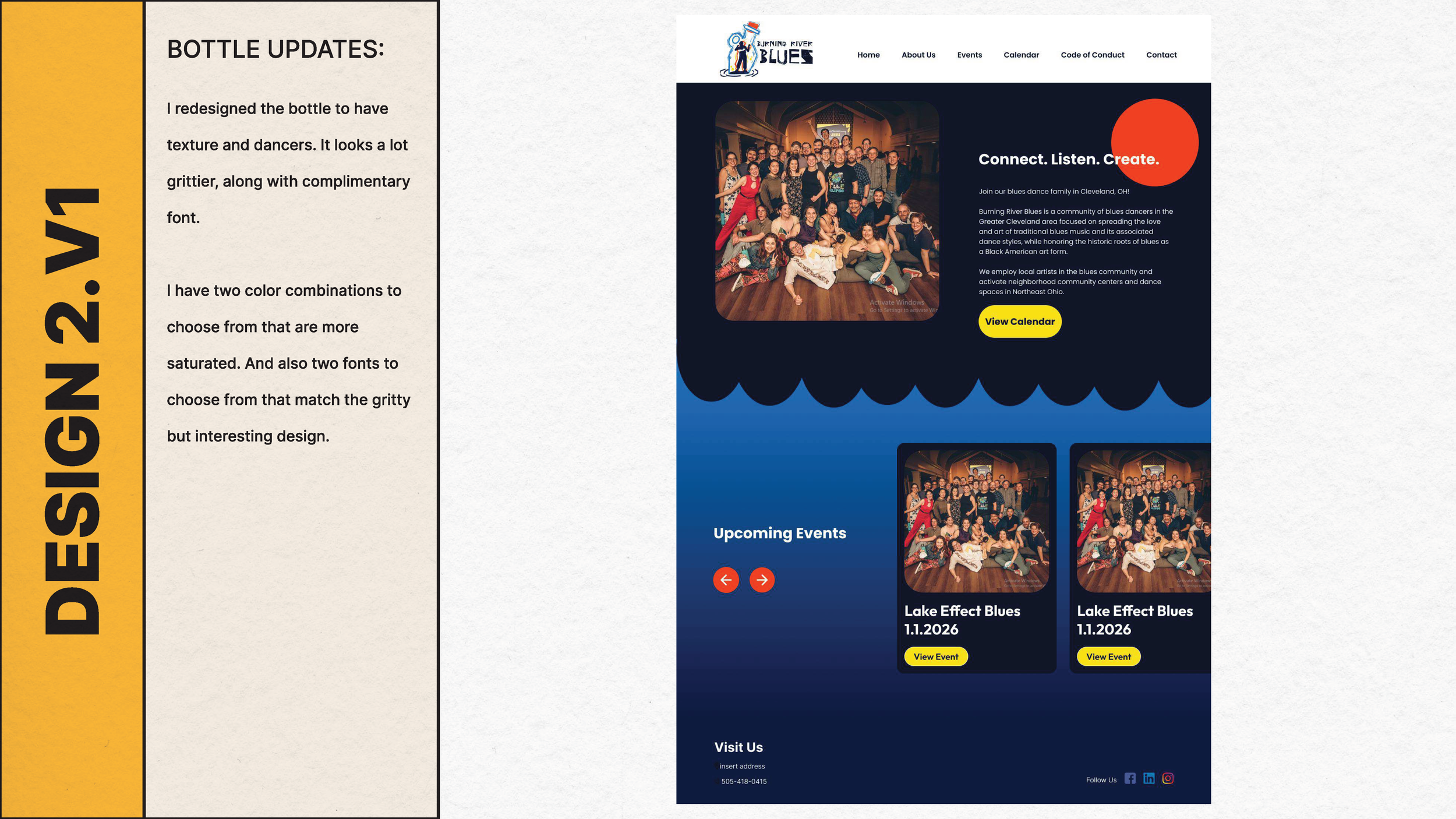
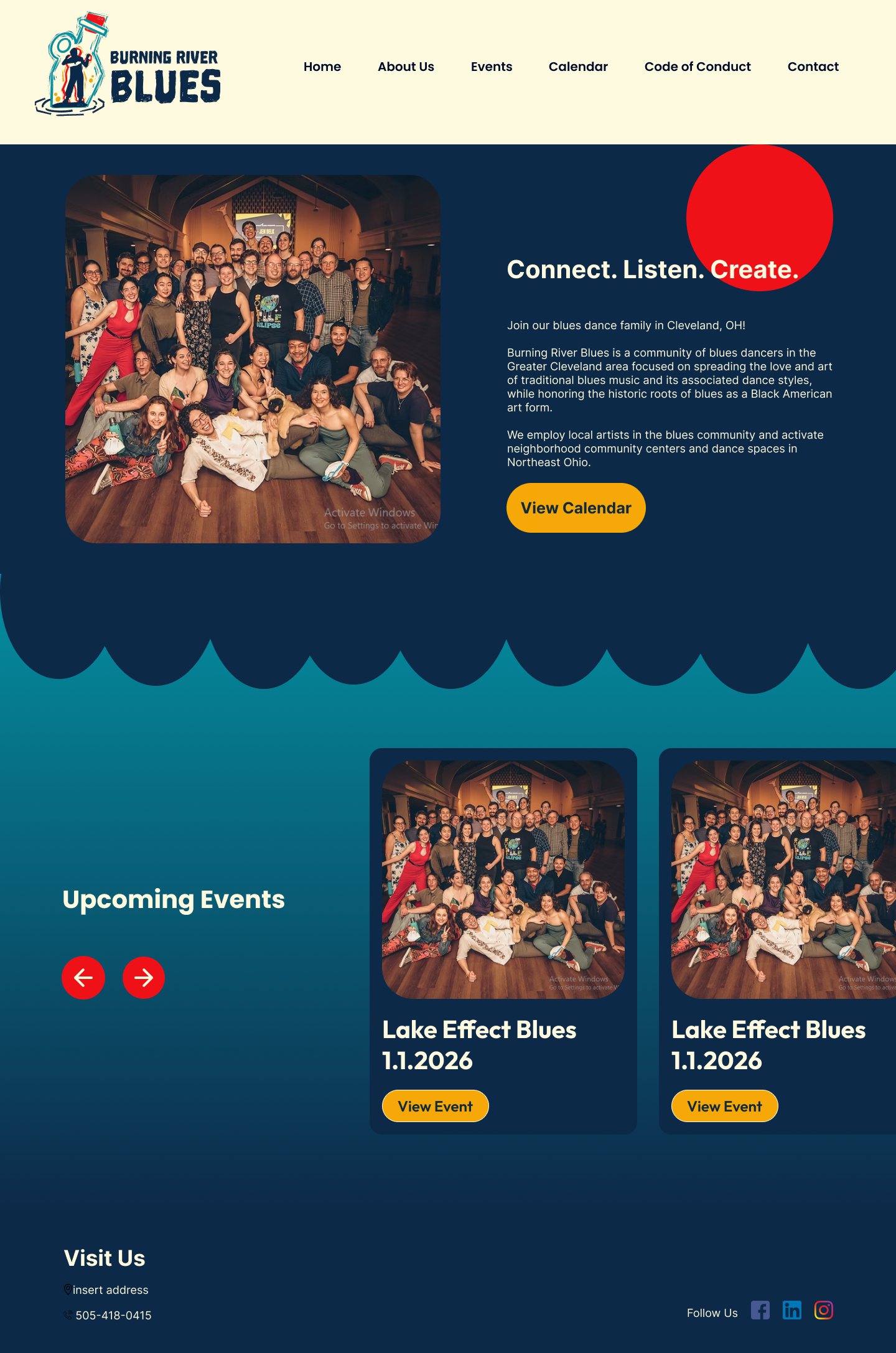
I developed a refreshed visual identity that included a custom illustrated emblem, logo, and supporting graphic assets to capture Burning River Blues’ gritty, authentic aesthetic. The website was redesigned to align with the new branding through cohesive typography, imagery, and textures, resulting in a stronger, more recognizable identity that better reflects the organization's mission and personality.
Style Guide
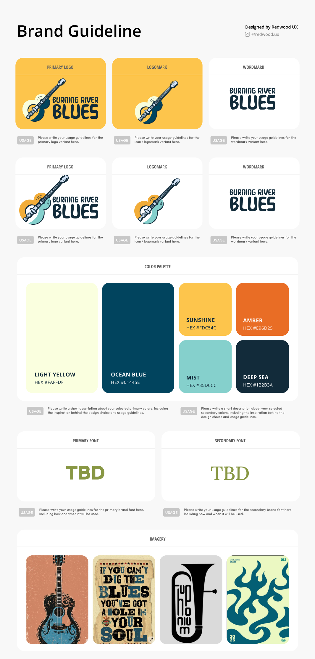
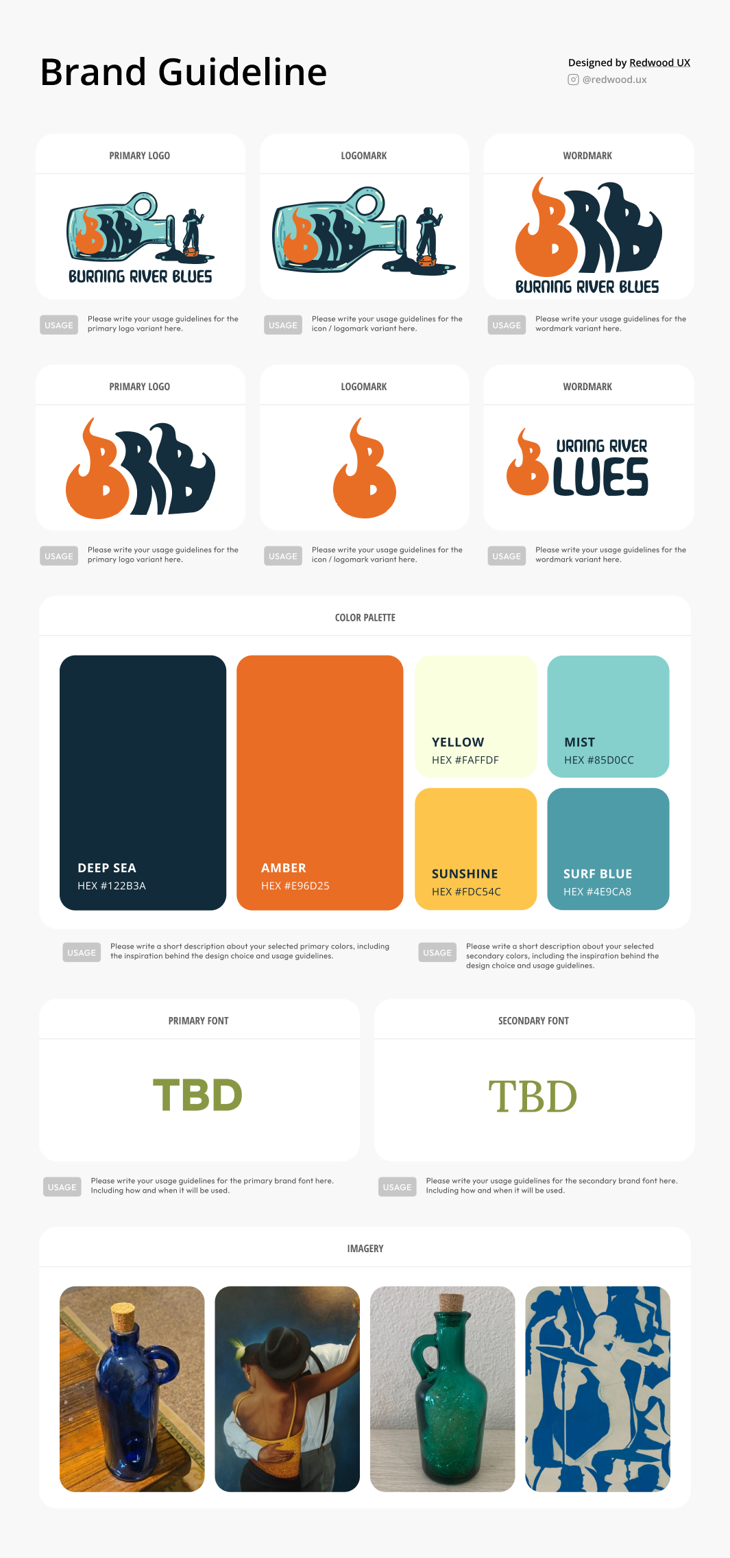
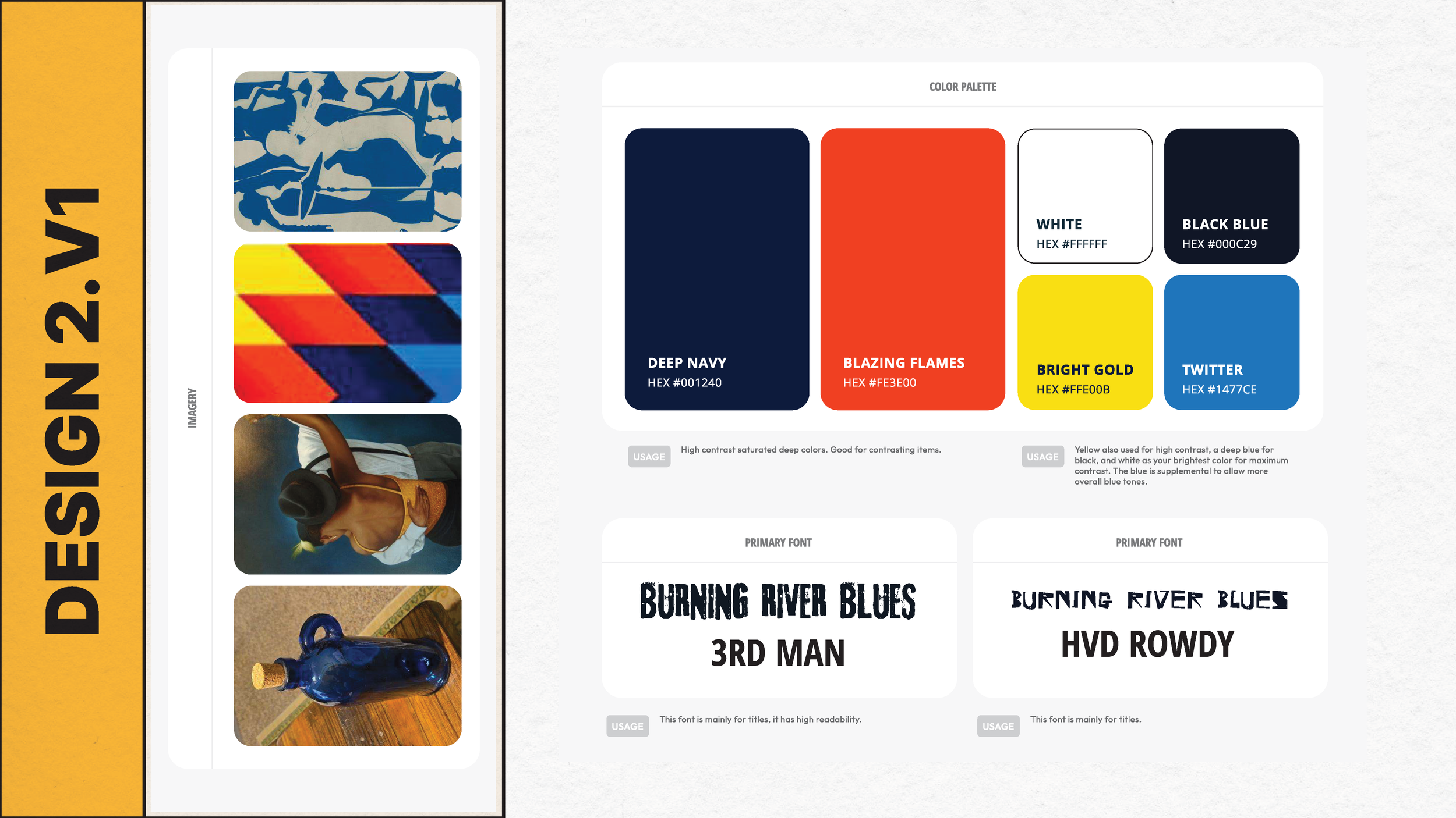
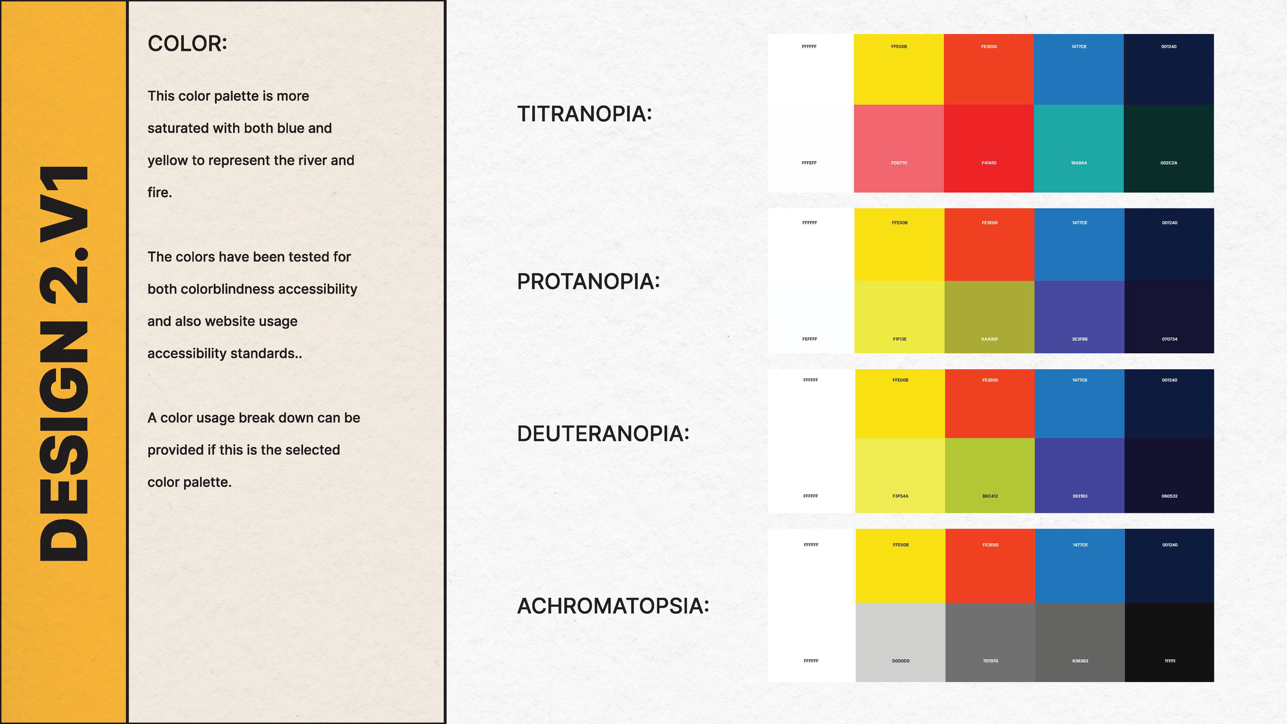
For this project I provided the client with a style guide to give references of multiple designs and options in one file. This allowed the client to view the designs side by side, while also giving context to the design decisions and possible directions we could take them.

Feedback - first round
Clients loved two different designs and I gave them more time on each design.
What they liked from each design:
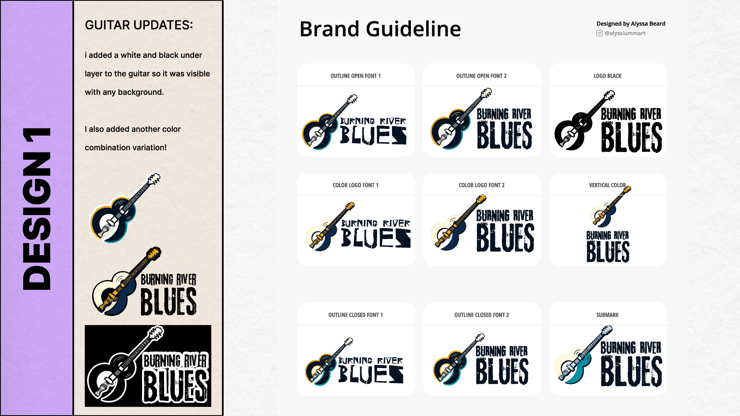
Design 1: Clean guitar design. Had the Fire and Water color elements without being too on the nose. Clear connection to the music scene, but didn’t represent dancing as much.
Design 2: An unexpected design choice! They liked the ideas of a haint bottle. (I gave the information on a haint bottle from Gullah Geechee culture) They enjoyed the homage to the river without making the river a focal point. This gave space for possible flames or dancers in the bottle.
Feedback - round 2
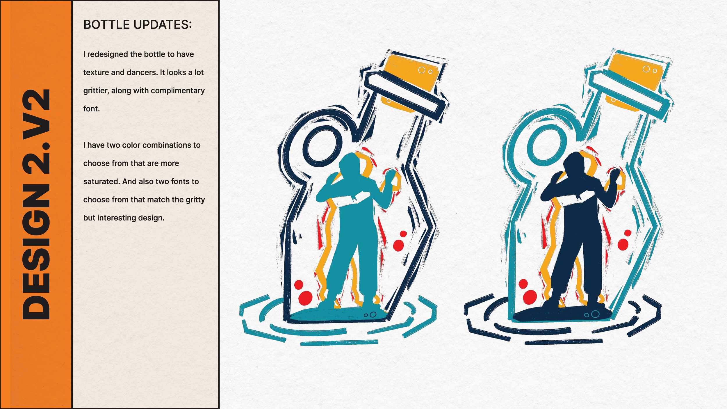
Clients wanted to focus more on design 2 and figure out different ways to incorporate dance.
Requests:
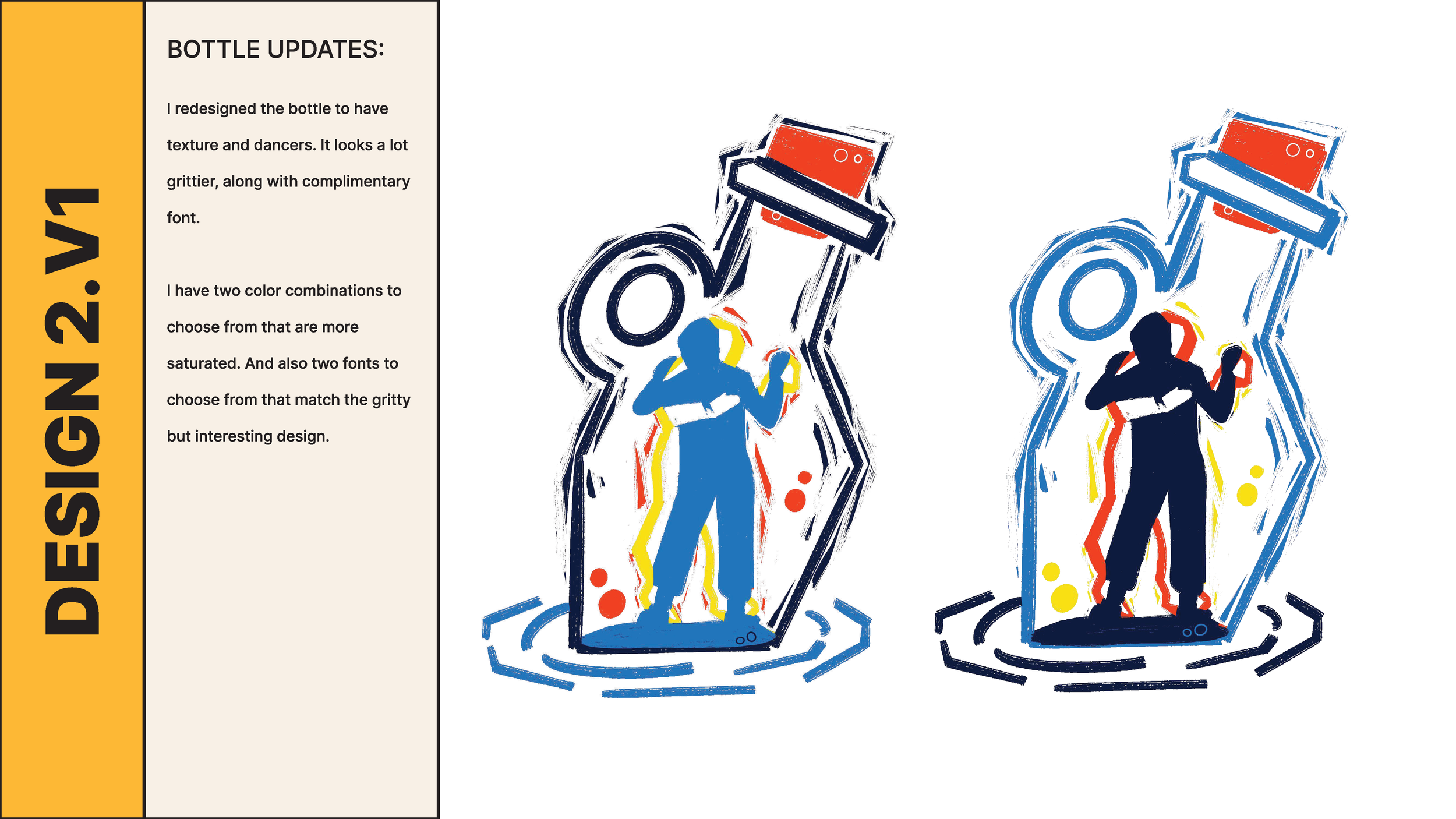
Changing the possible texture of the design to make it a bit grittier
incorporating dancers, possibly inside the bottle
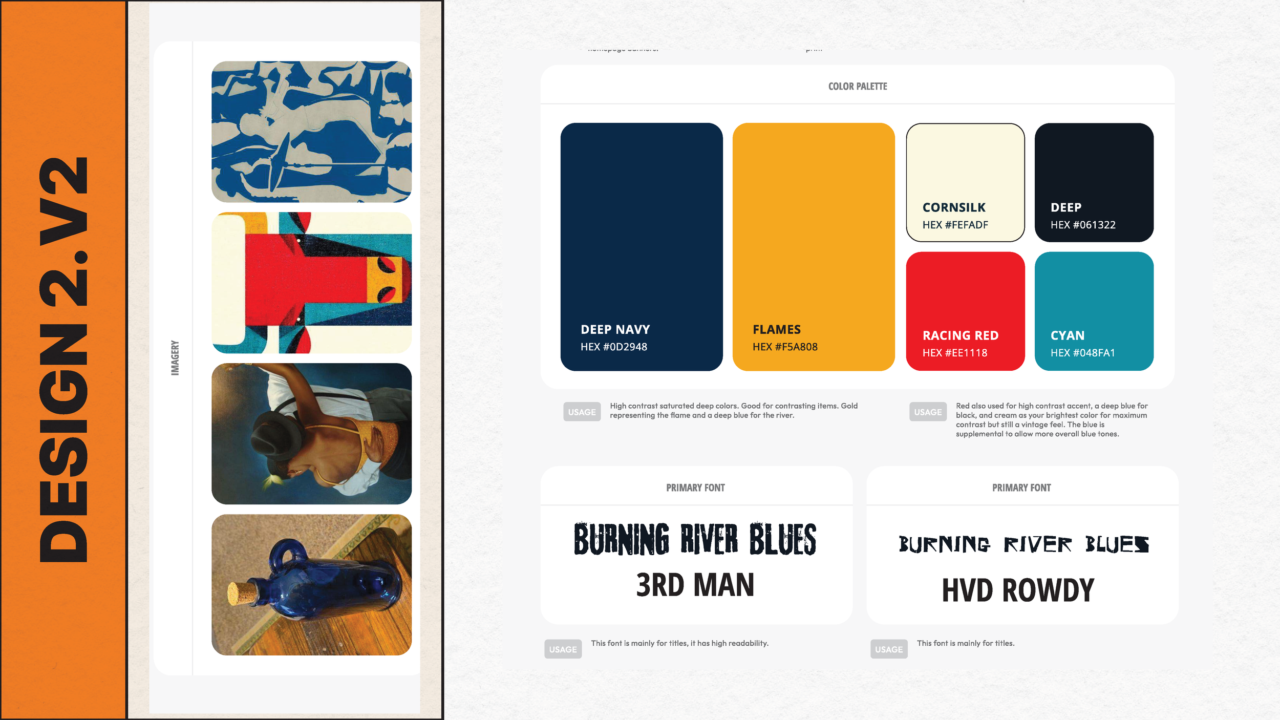
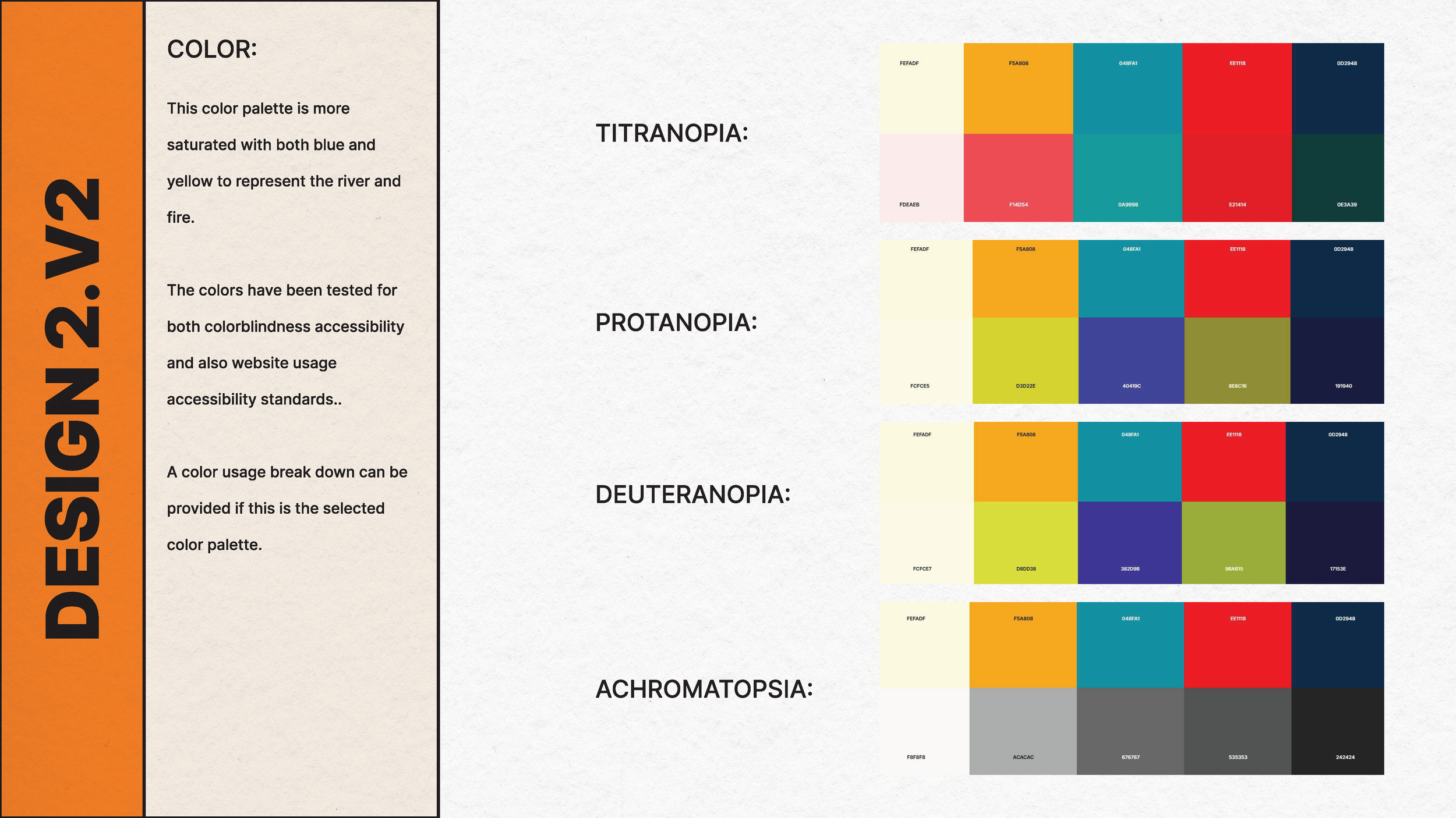
playing with different color combinations
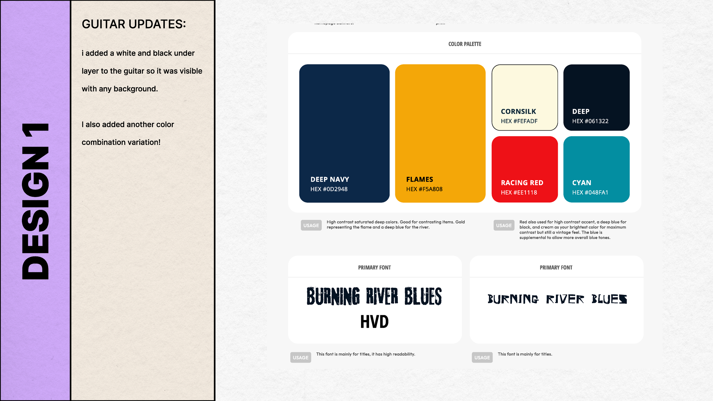
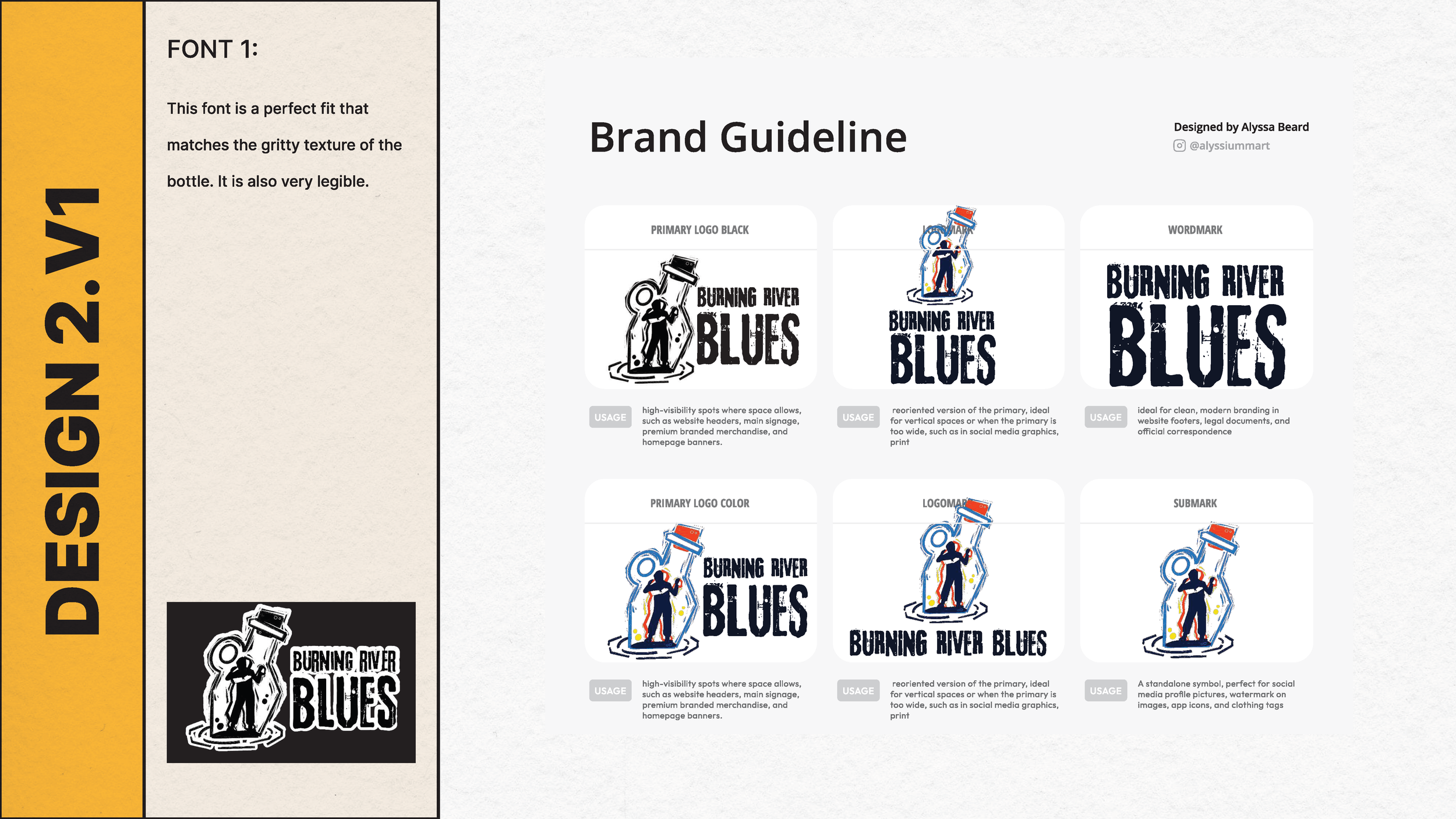
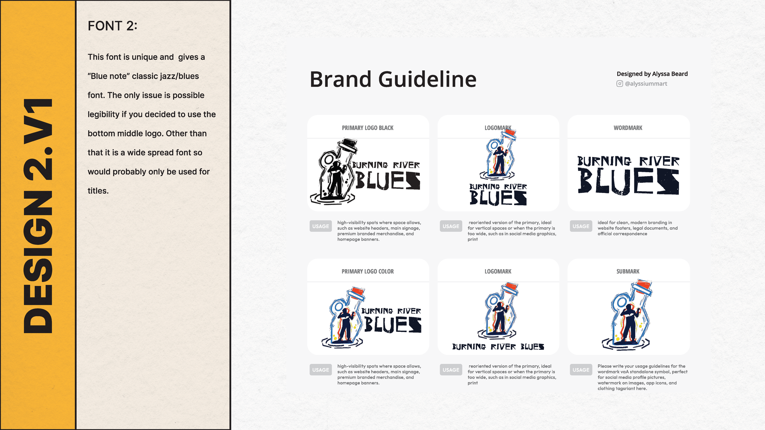
Settling on a distinct font
Final Designs
21 Final Assets
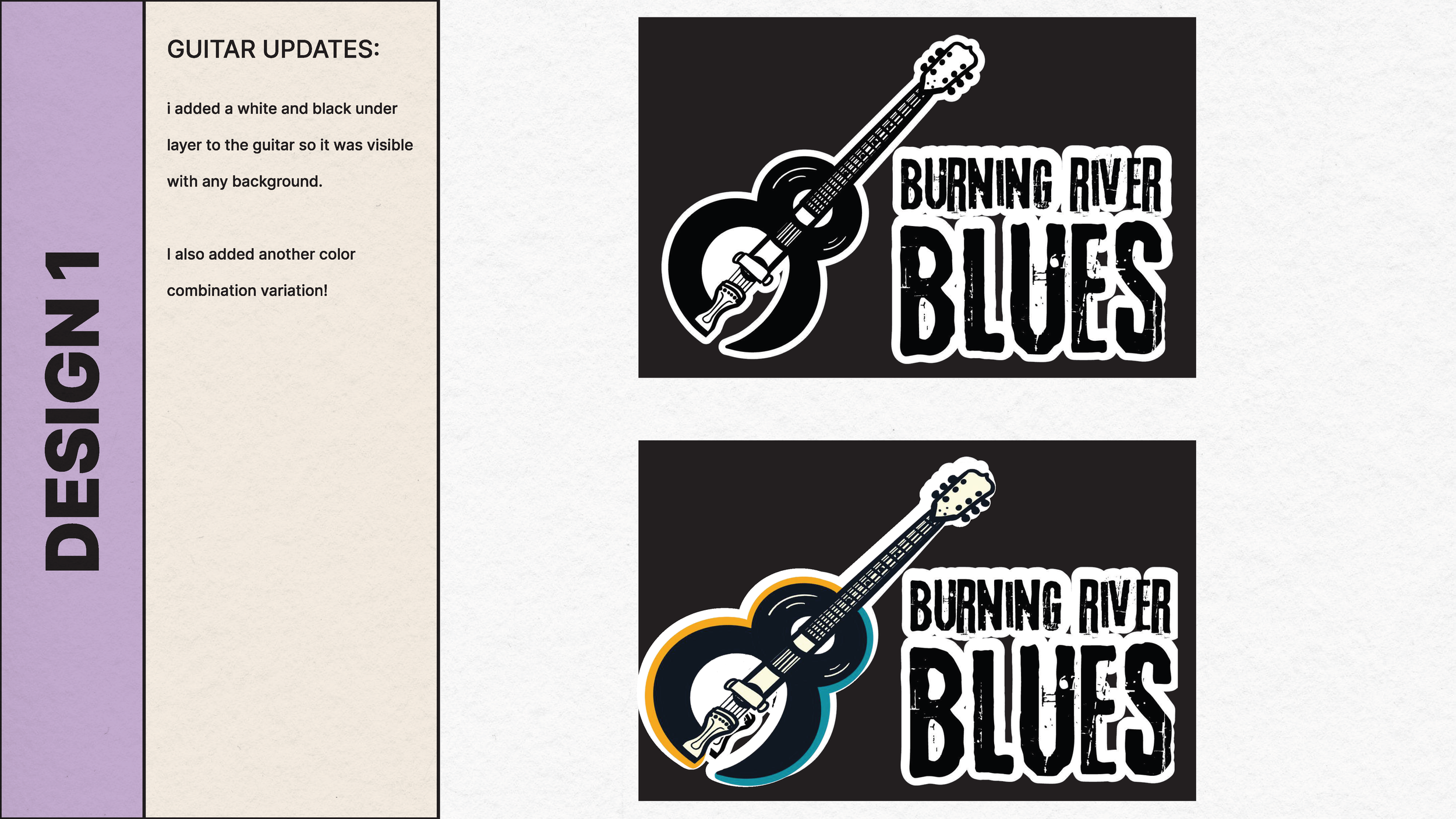
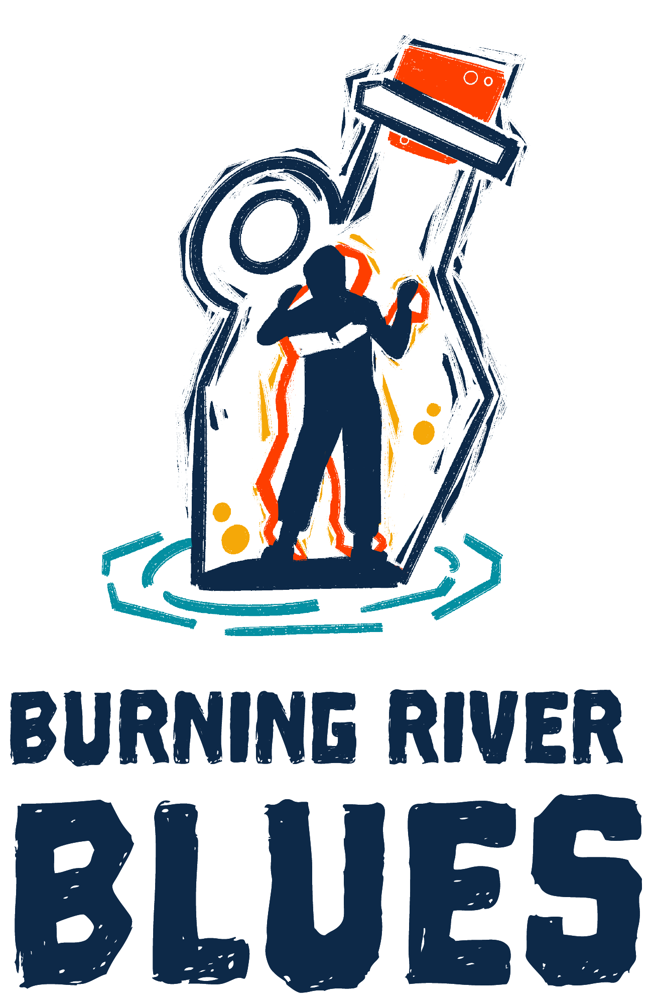
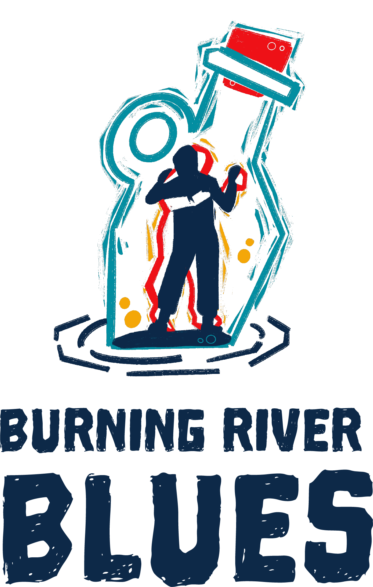
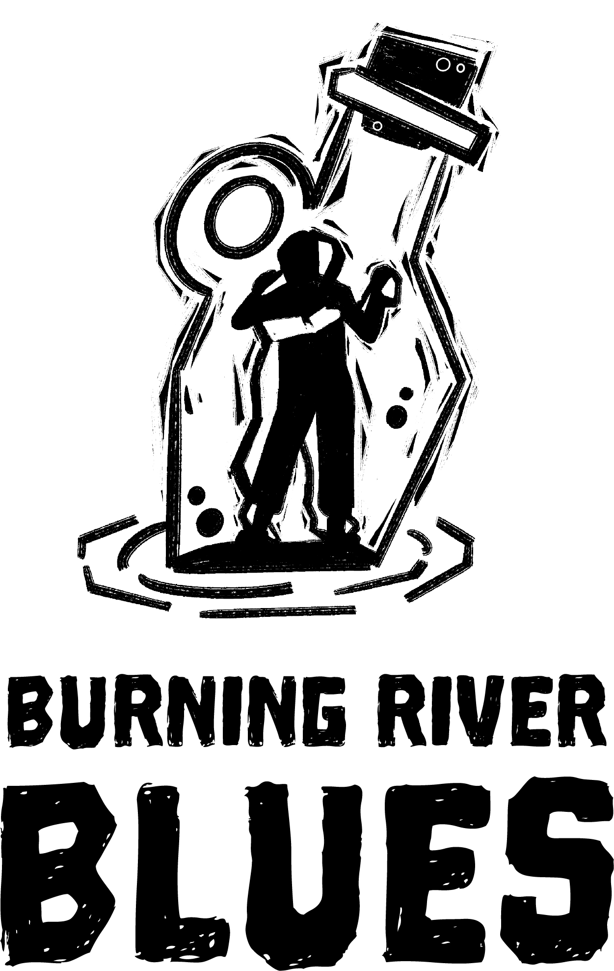
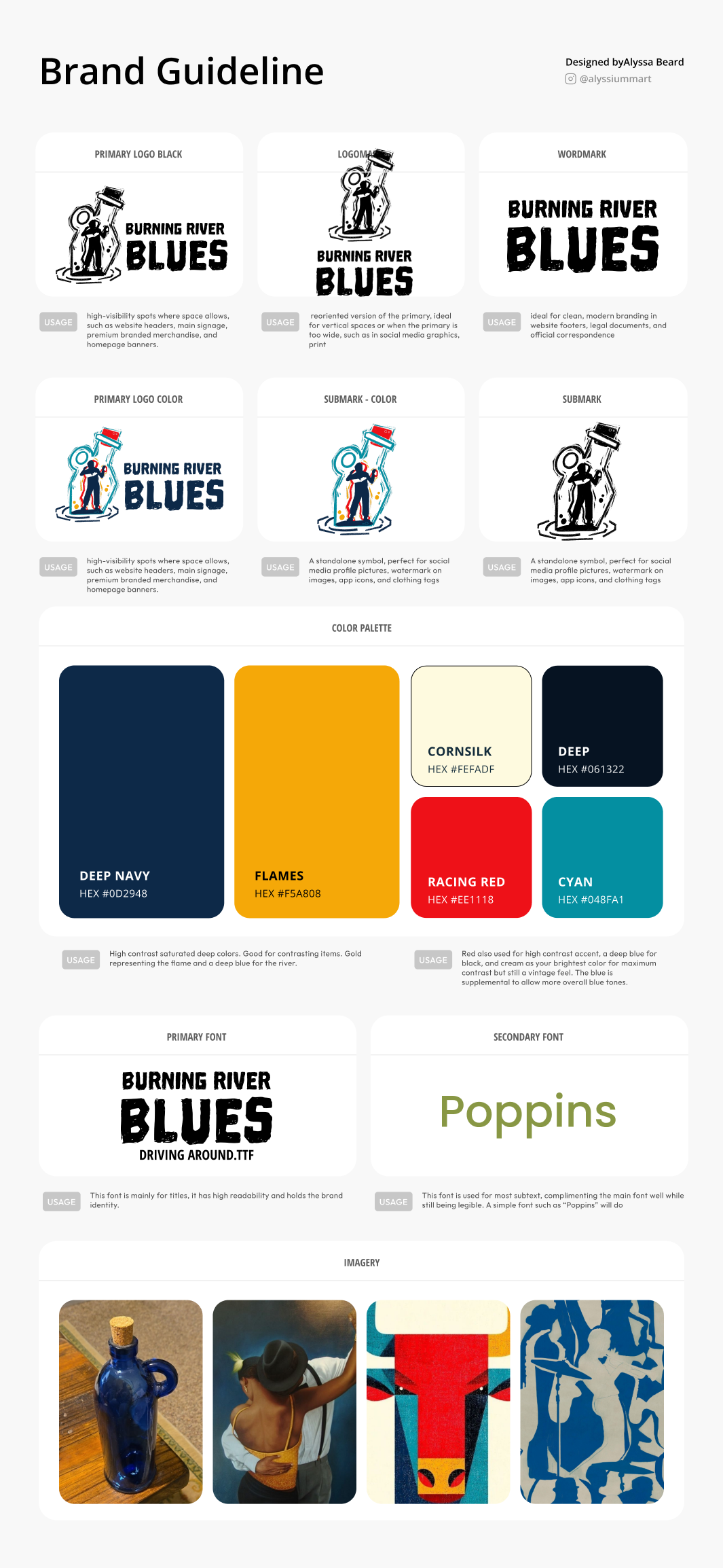
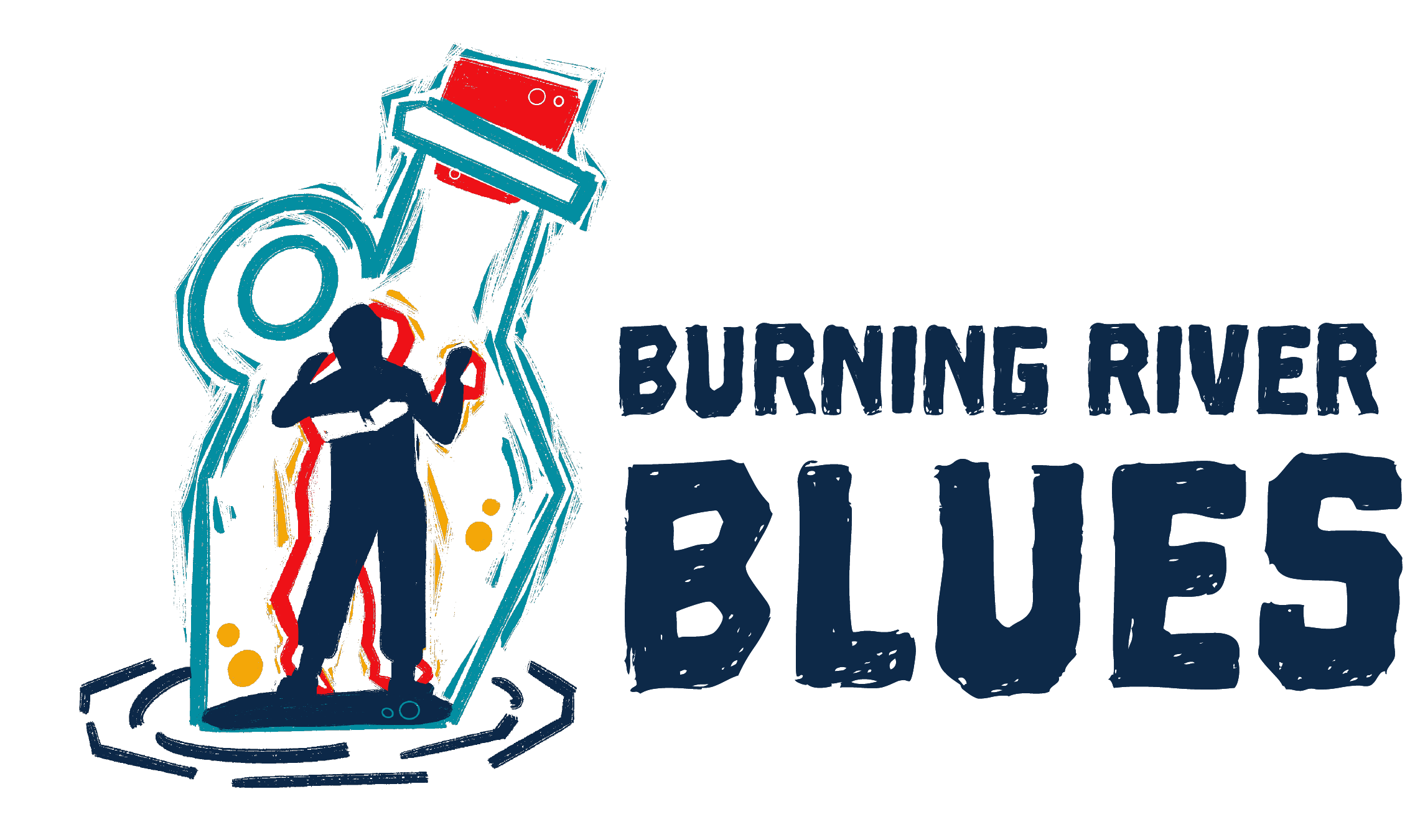
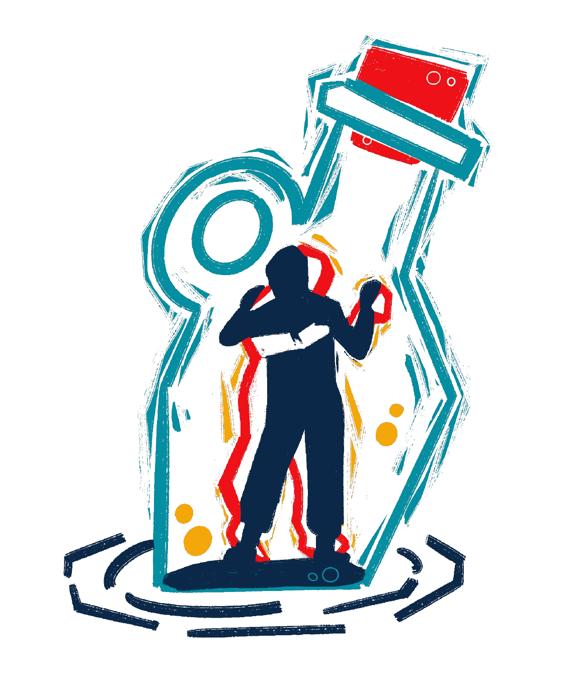
The completed brand package included a versatile logo system designed for use across both digital and print applications. Deliverables consisted of a custom illustrated emblem, horizontal and vertical logo lockups, full color versions, outlined border variations, and black and white versions. I also provided a commercial free use font that can brand the website even further, along with visual identity color guide. This cohesive set of assets ensures the Burning River Blues brand remains recognizable, flexible, and consistent across a wide range of marketing materials, merchandise, and online platforms. This included 4 different color variations (main, dark, black, and yellow) with accompanying white borders for dark background, and a brand guide.
Reflection
What I Learned
Least Expected Option
Sometimes you come prepared with the most detail you can on multiple design options and the client still picks that last second idea that had more time to cook. Leaving space for ideation really does create unexpected outcomes.
Client Communication
Clients would often speak separately but together about their likes and dislikes on each step of the design. I would make it clear from project start on designating one point person to avoid contradicting info and confusion.