

Footnotes
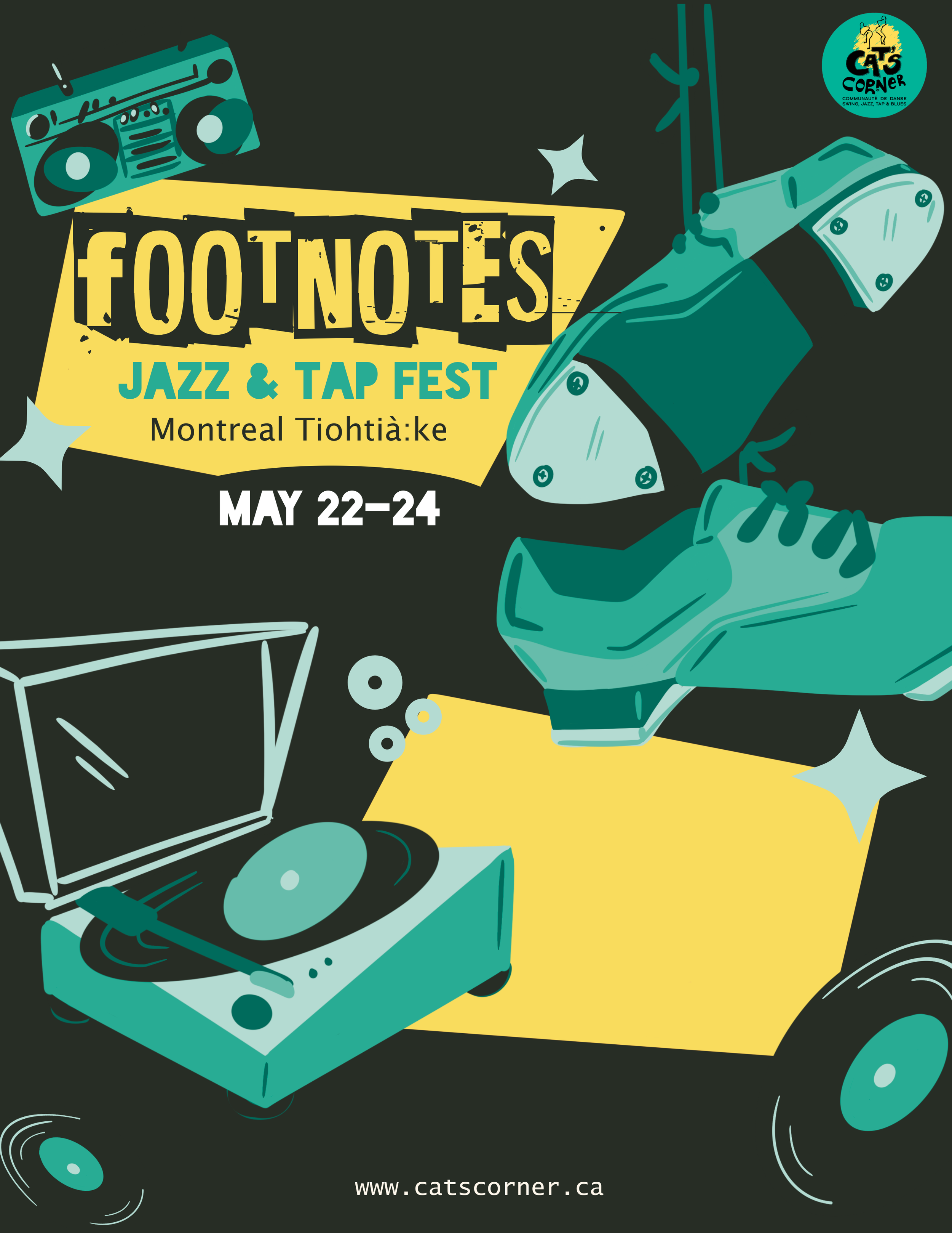
Footnotes highlights the legacy of Lindy Hop and Tap Elders while celebrating jazz dance and Black diasporic cultures. Organized around National Tap Day and World Lindy Hop Day, our event brings together practitioners, community members, and audiences to learn, share, and connect through swinging jazz music and dance, fostering a welcoming space rooted in cultural appreciation and social engagement.
Role: Graphic Designer, client communication, illustrator, instructor
Project Context: Festival for Cats Corner Organization
Product Type: Event flyer, Social Media Banner, Event Booklet, Social media brand kit
Duration: 1 month, Jan-Feb 2026
Tools: Figma, Procreate, Adobe Illustrator
Problem
Cats Corner is seeking branding materials that reflect the collaboration of Jazz and tap dance styles, with a block party atmosphere and live music. They need event branding for social media that represents these Black American dance forms, and captures the spirit of the festival.
Solution
To represent Footnotes: Jazz & Tap Festival, I’m exploring designs that convey a sense of Black American community, pulling from personal experience. Clients asked to not incorporate typical dancers-inspired by overlooked urban elements within the culture to highlight diversity.
Style Guide
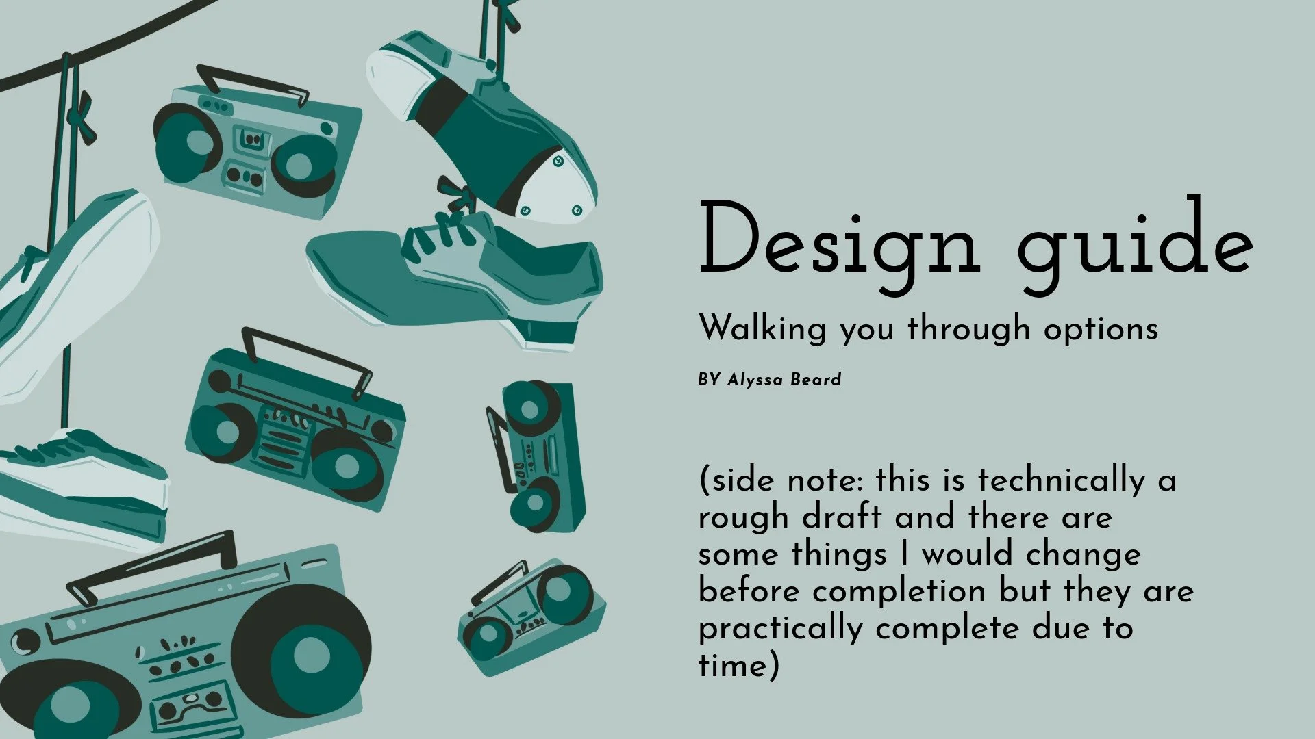
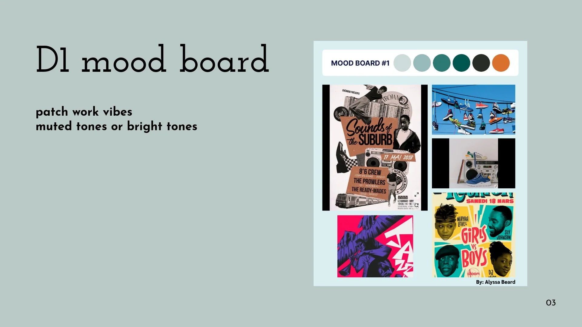
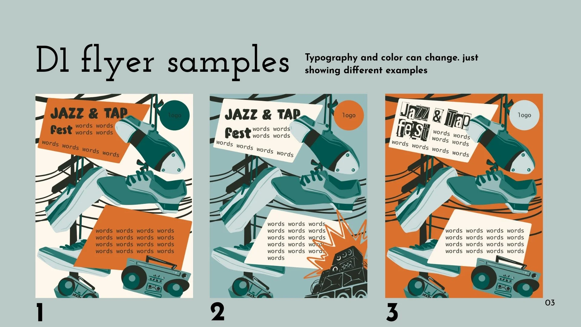
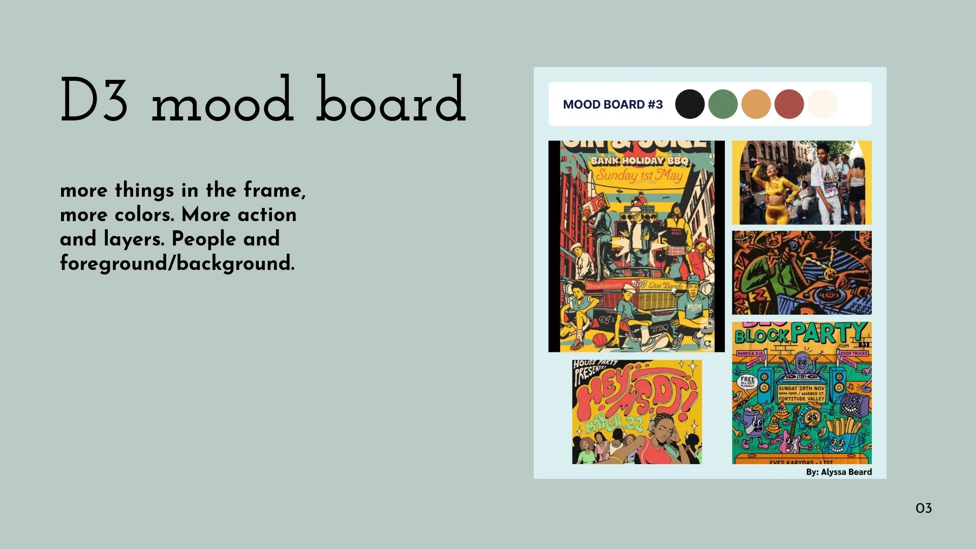
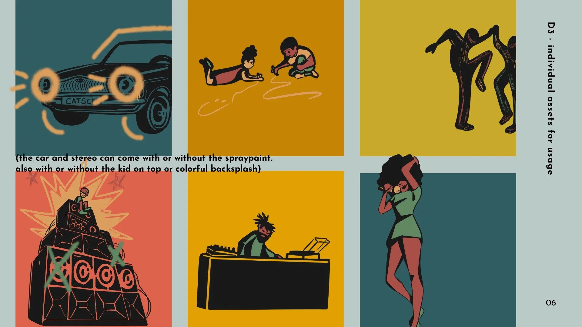
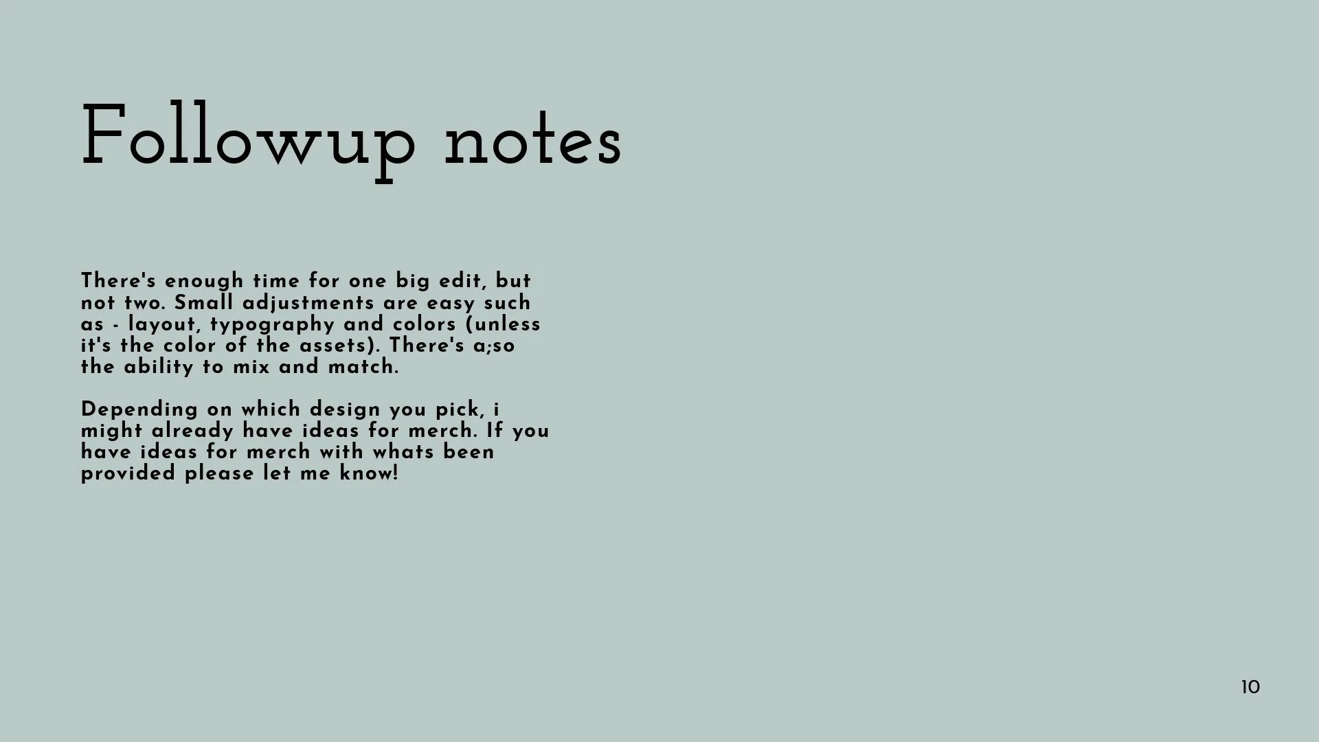
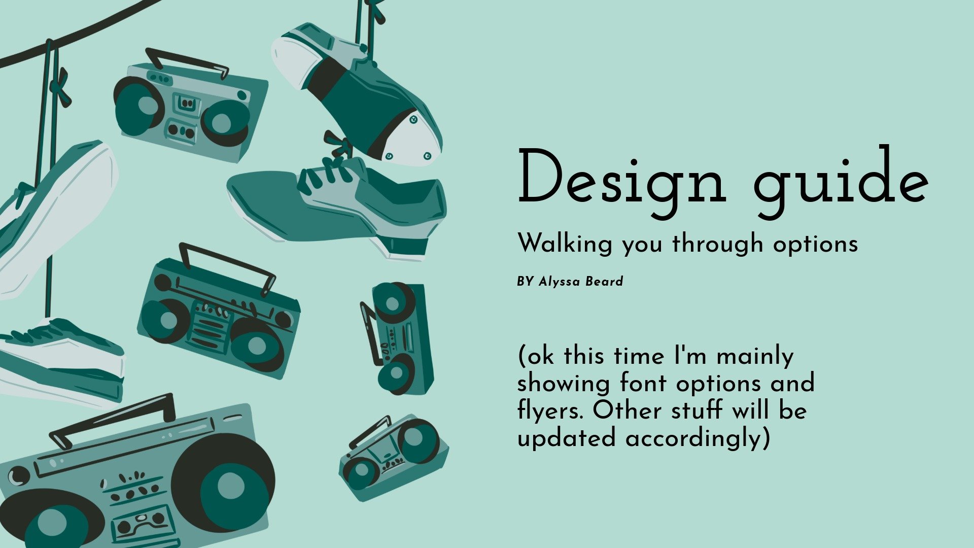
For this project I provided the client with a style guide to give references of multiple designs and options in one file. This allowed the client to view the designs side by side, while also giving context to the design decisions and possible directions we could take them.

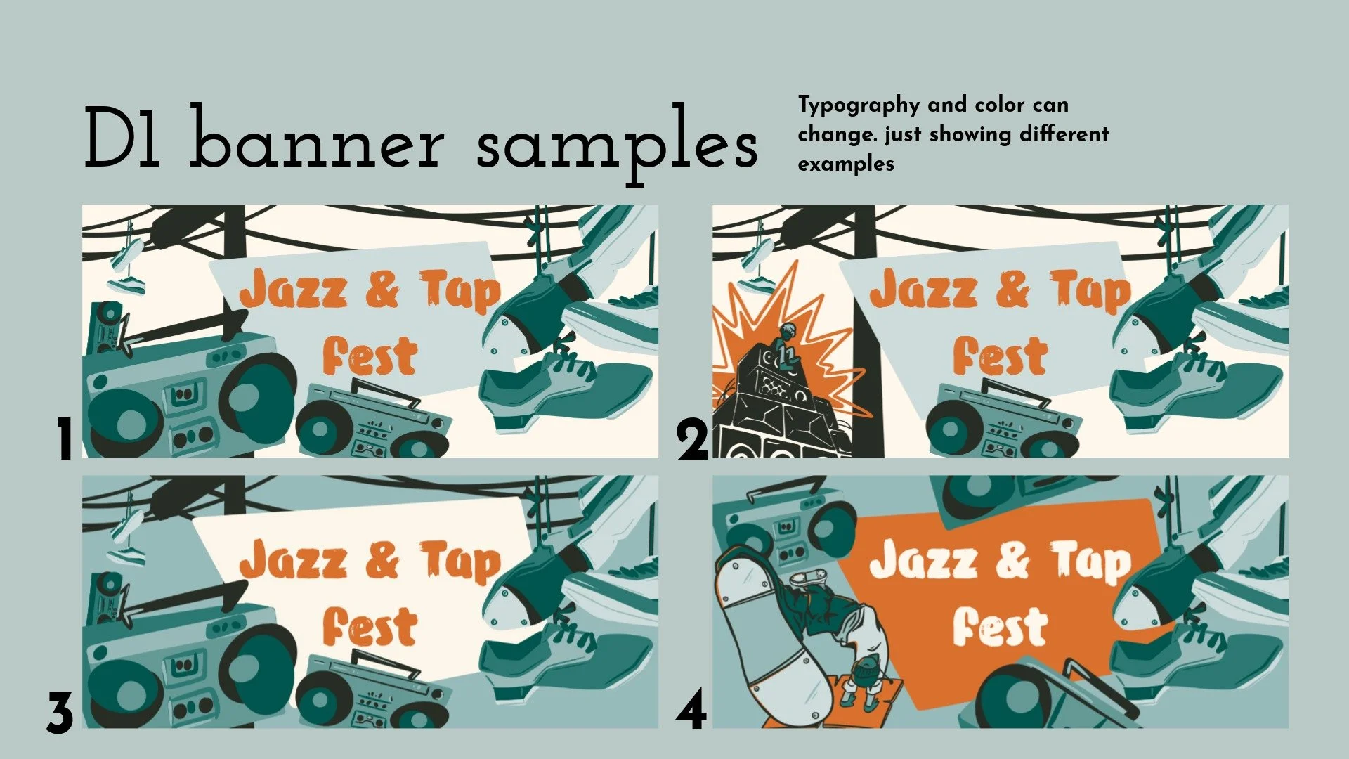

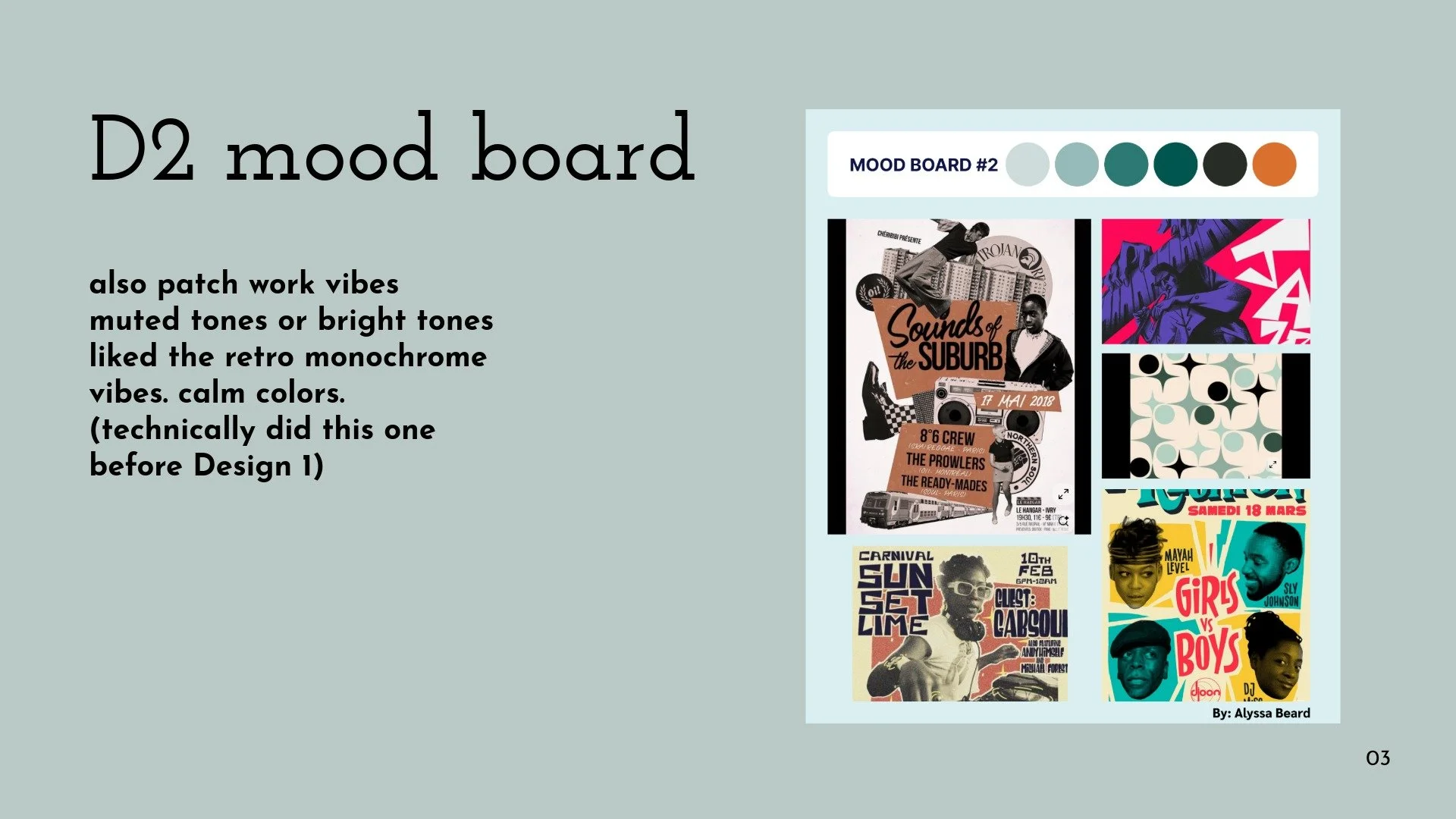
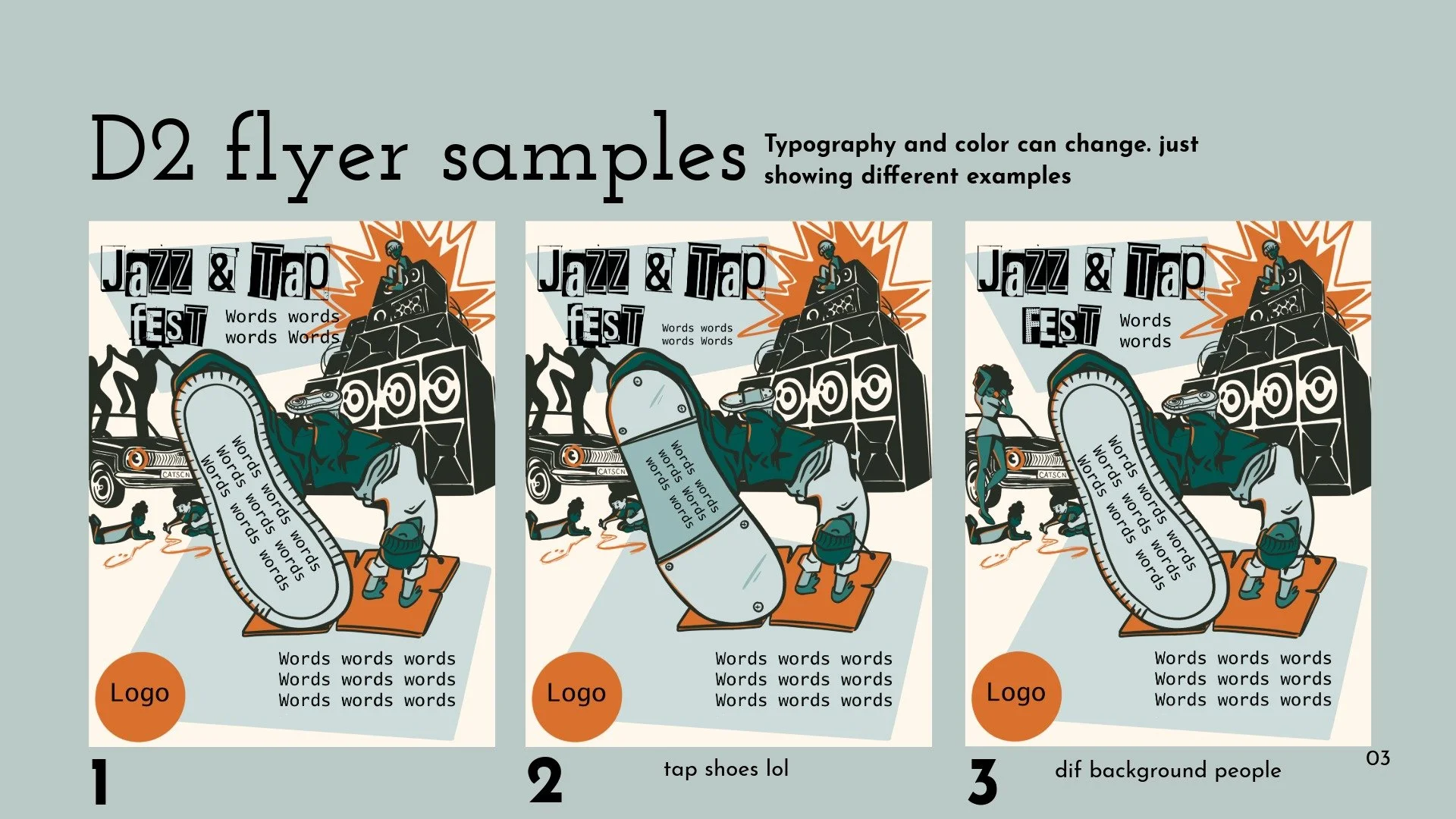
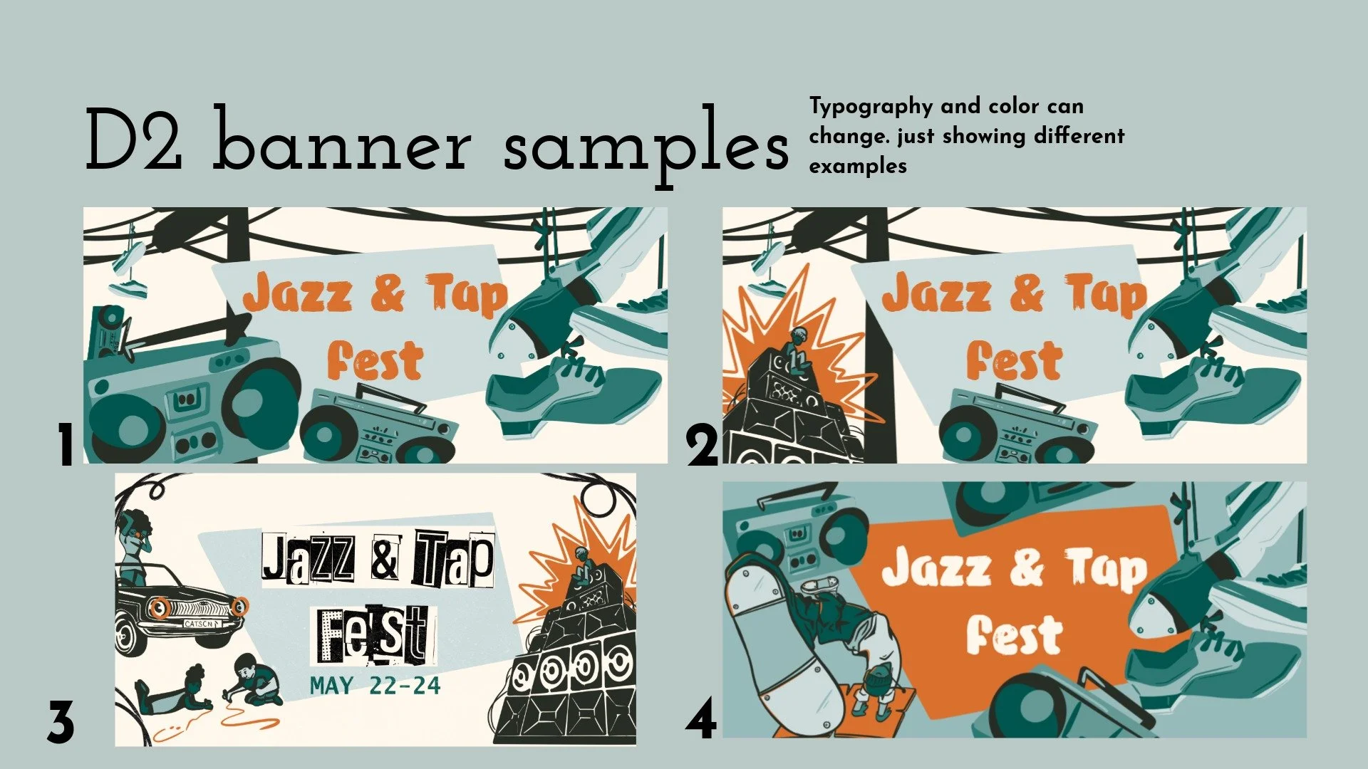
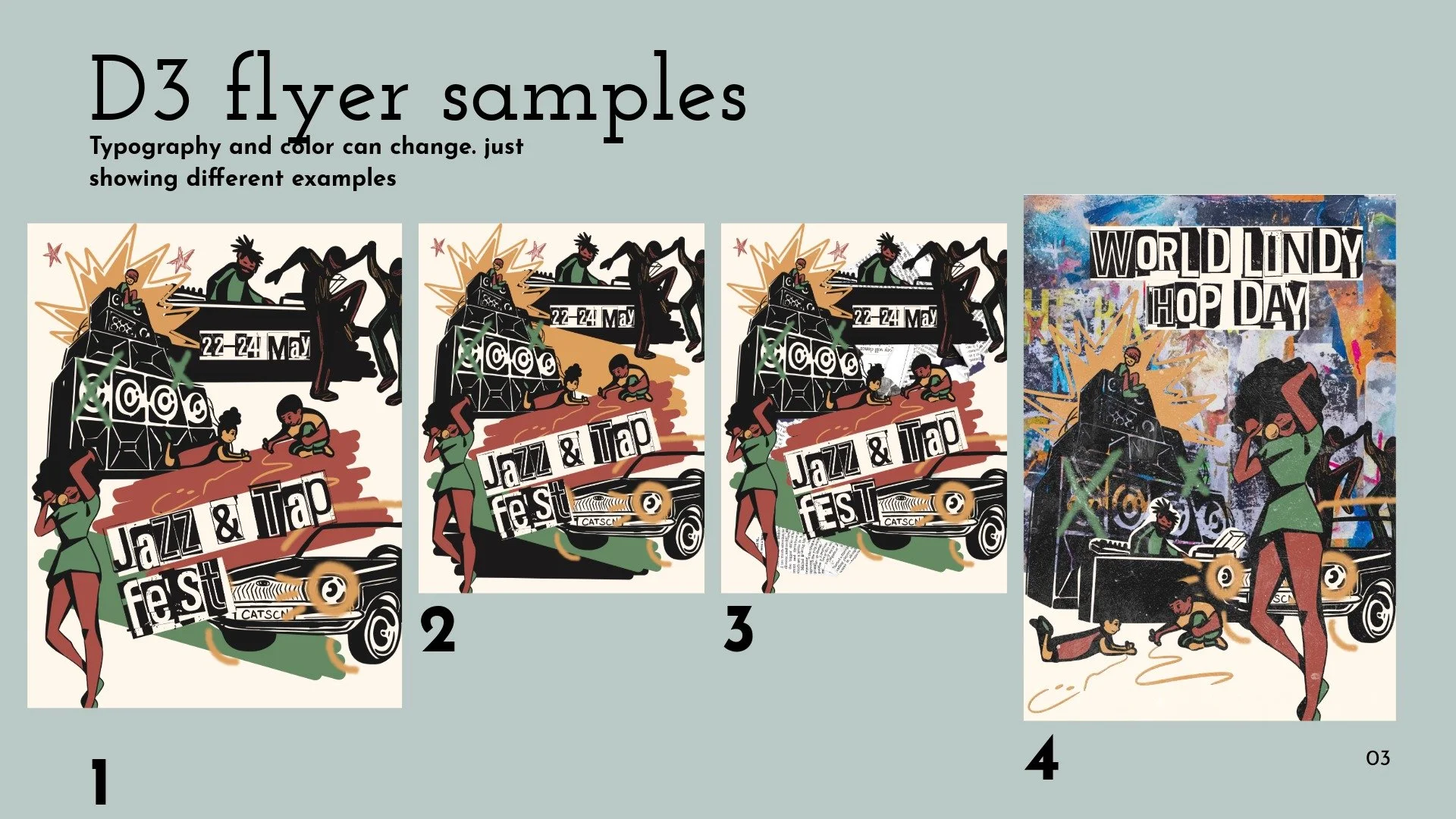
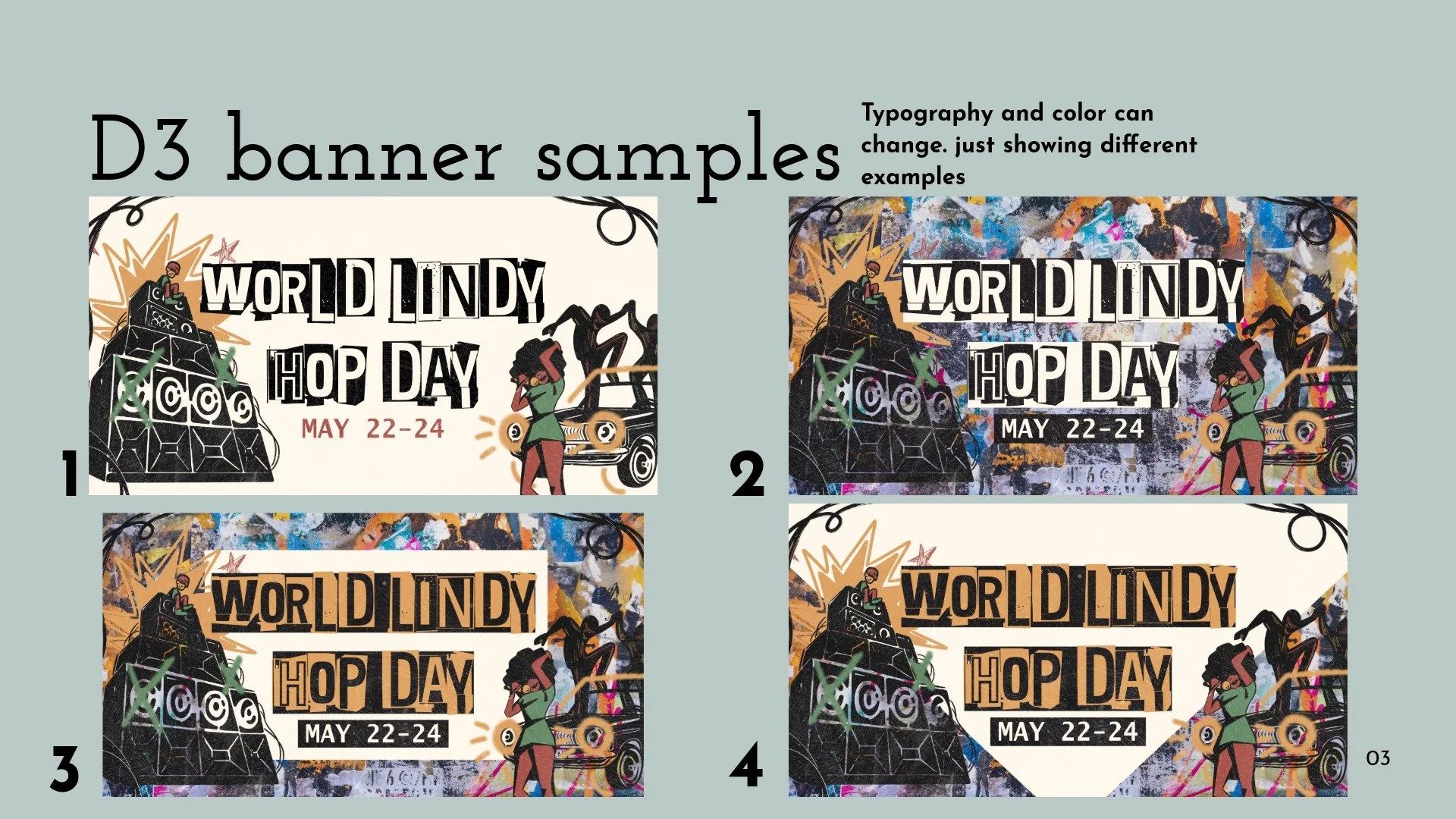
Choosing direction
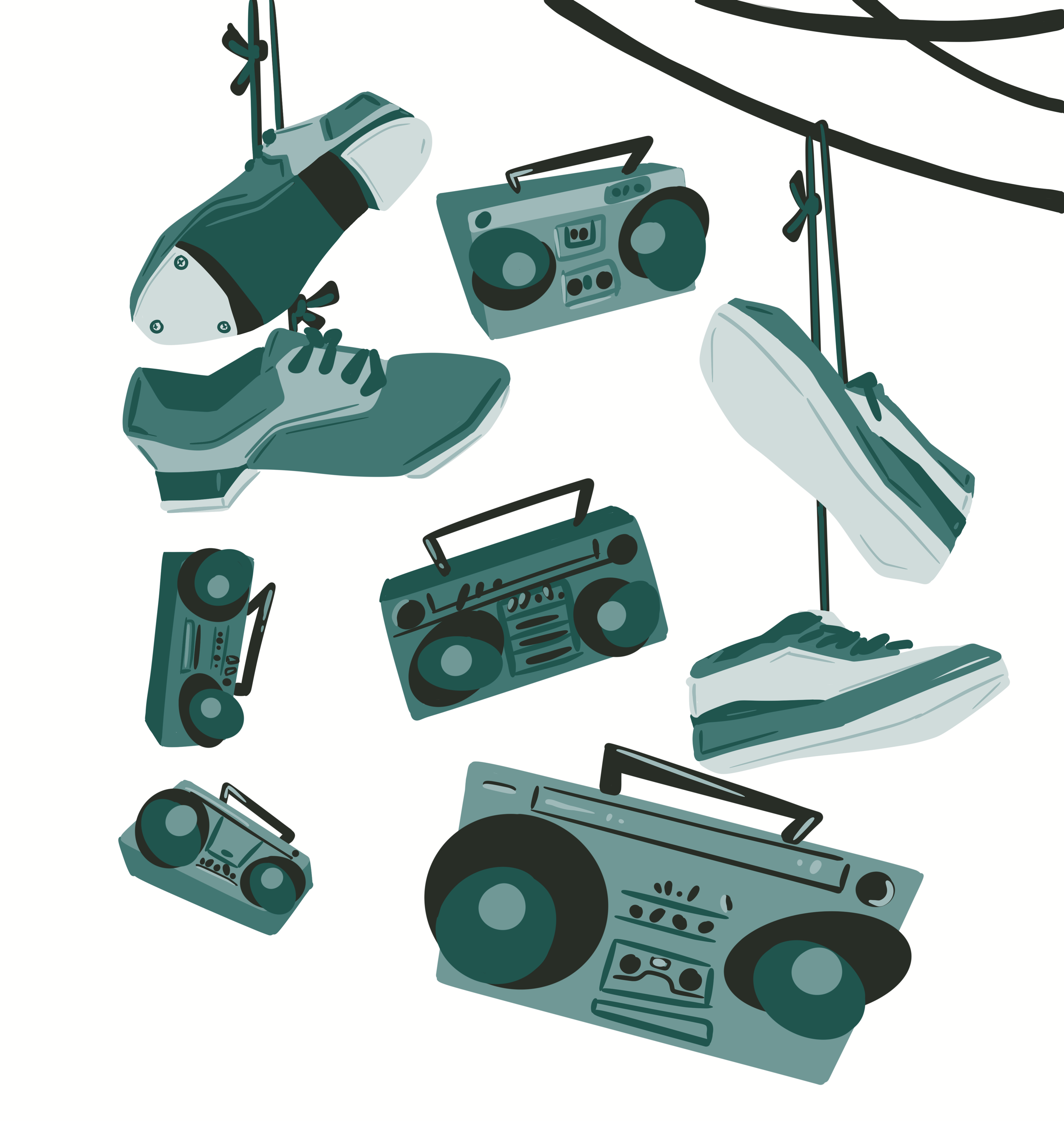
Clients loved the first design because of the sleek feel and cohesive colors that could easily be incorporated into the Cats Corner marketing.
What they liked:
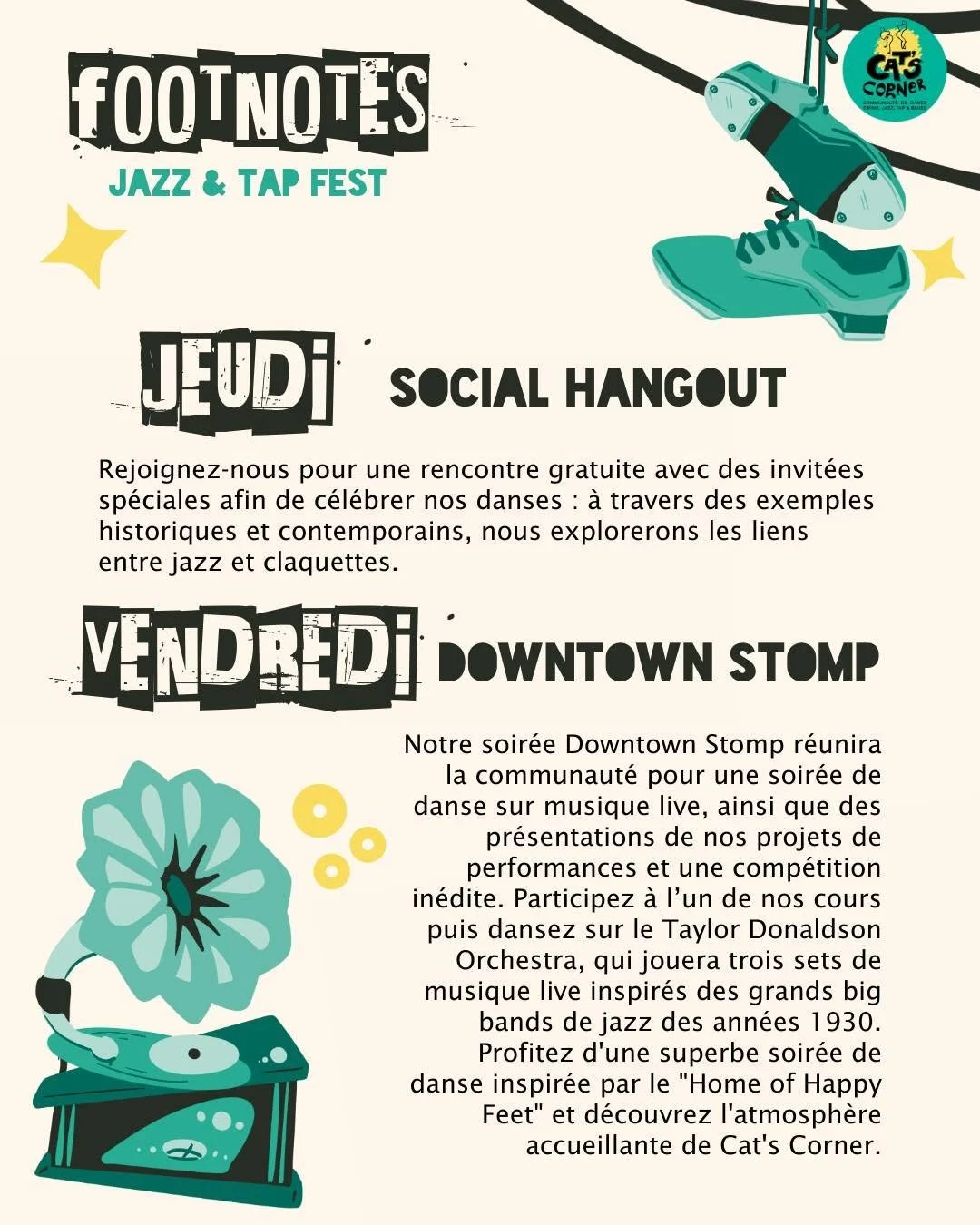
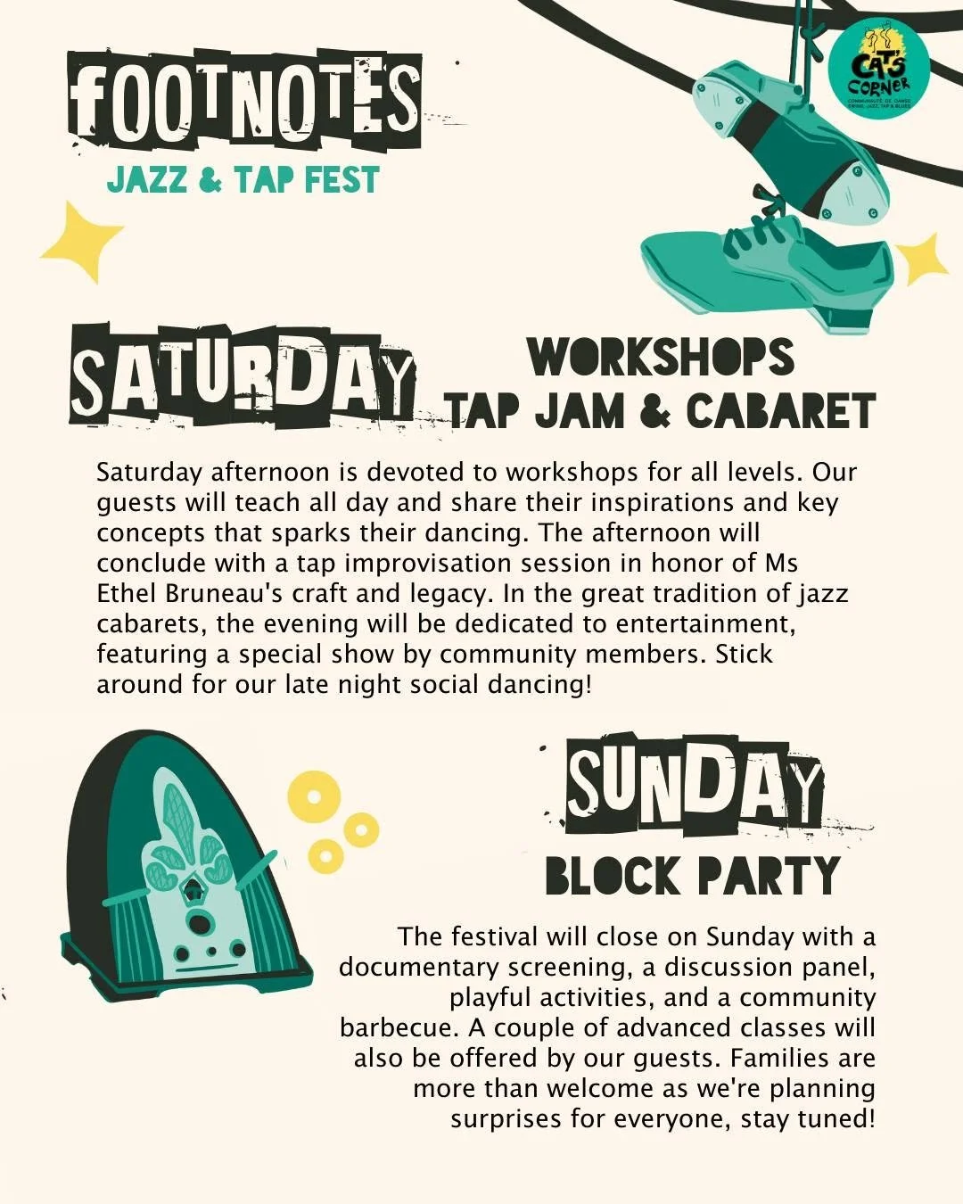
Design : Clear, simple, sleek. Brings in tap shoes with an urban feel like shoes hanging from wires.
Feedback - round 1
Clients wanted to focus on design 1 with these changes.
Requests:
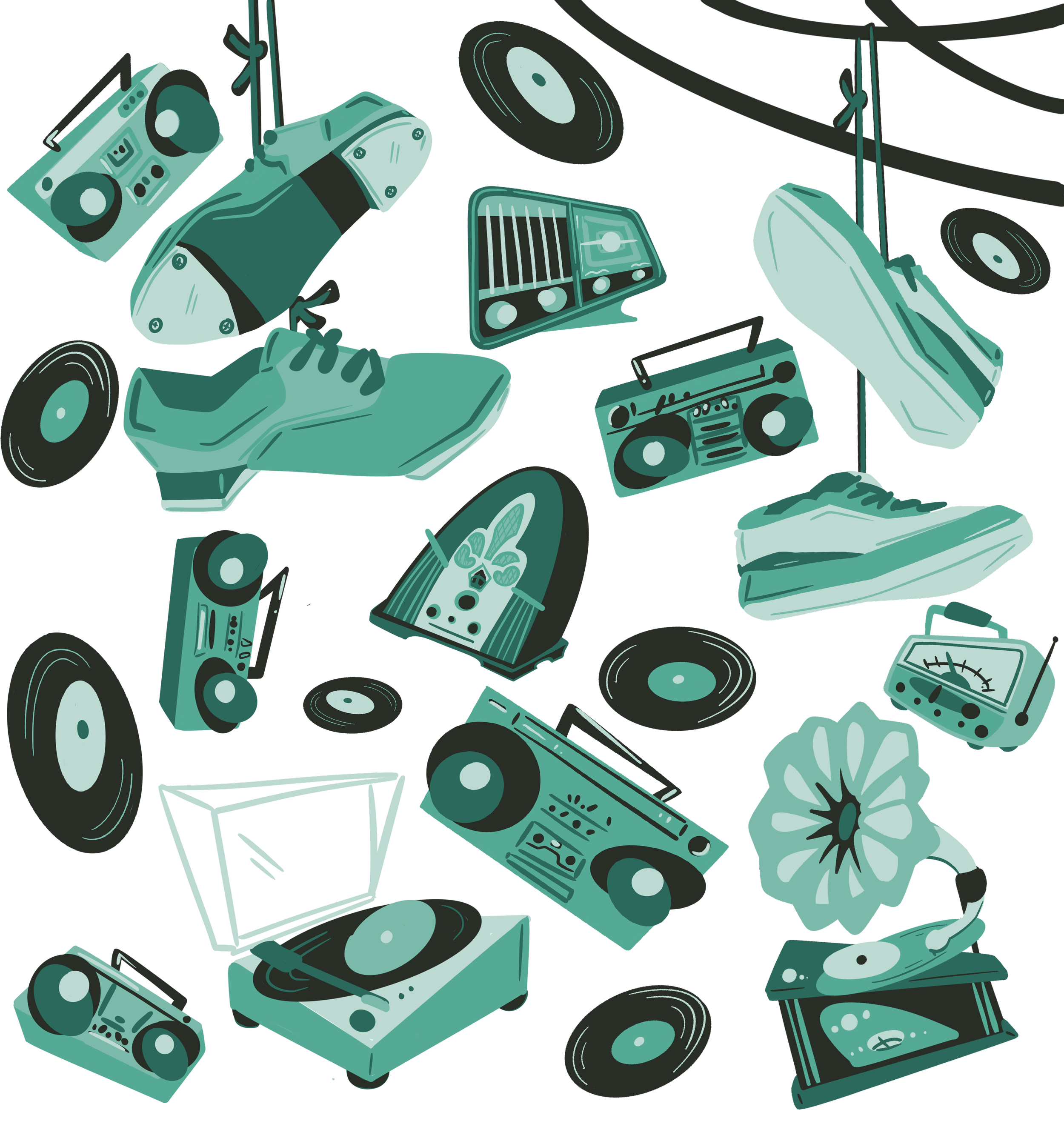
Incorporate Cats Corner Hex code branding colors
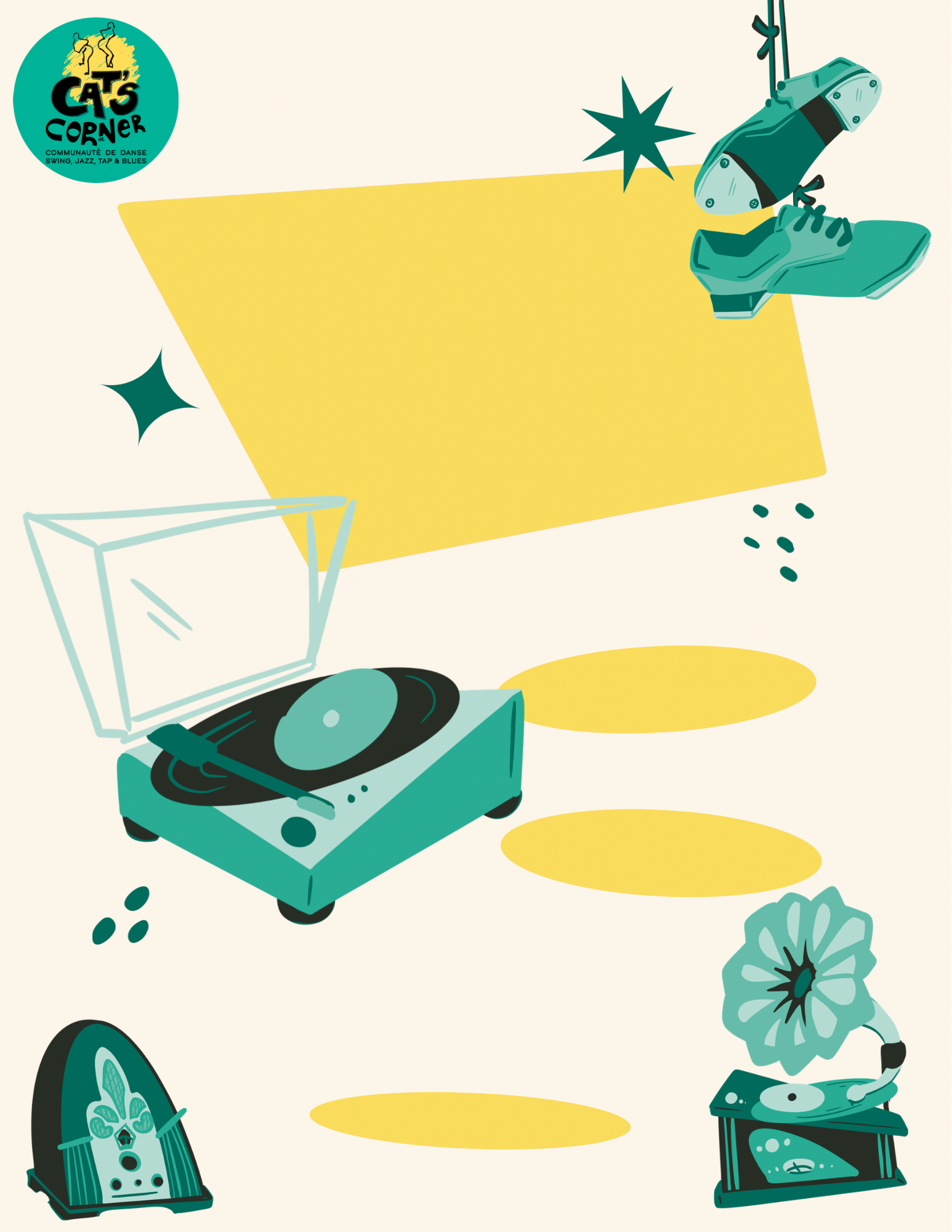
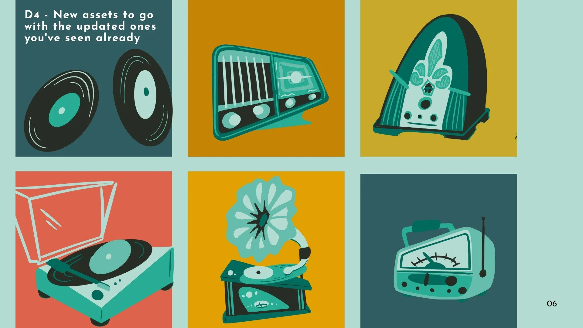
Turn some of the music pieces into older items like a Gramophone.
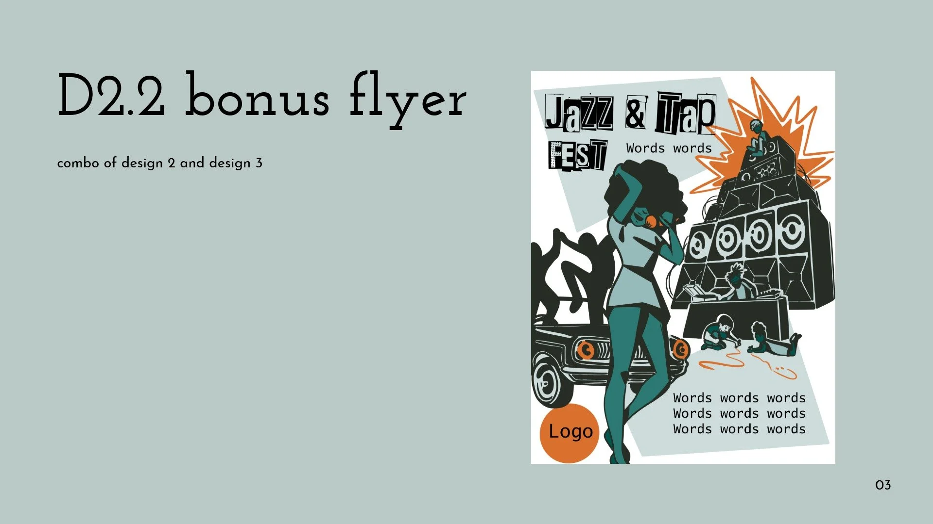
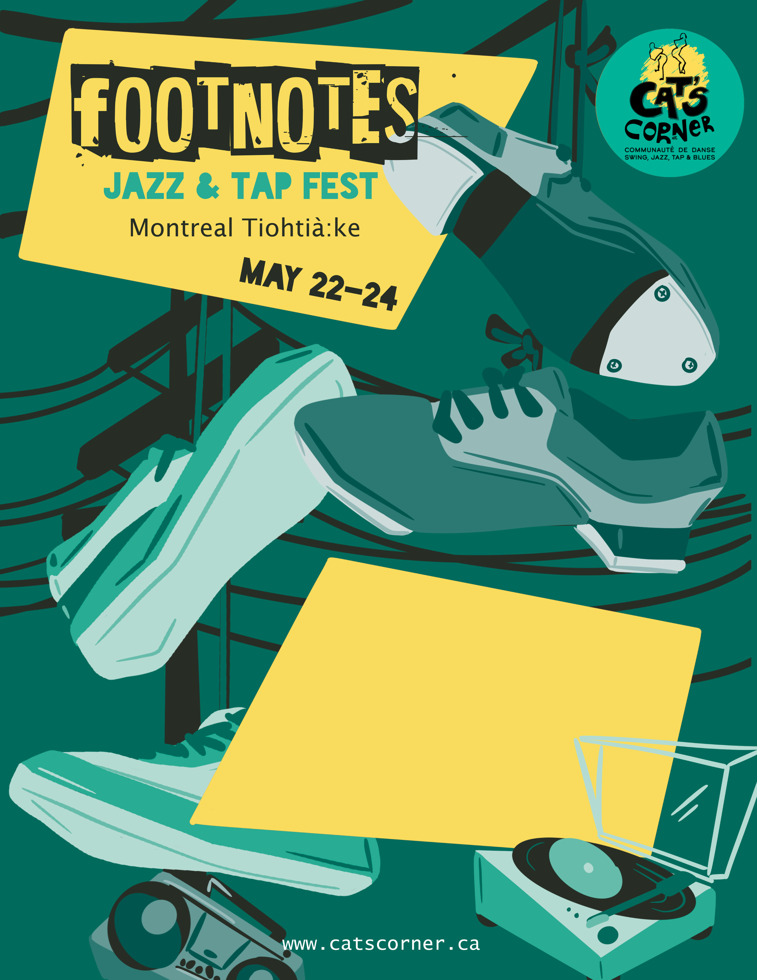
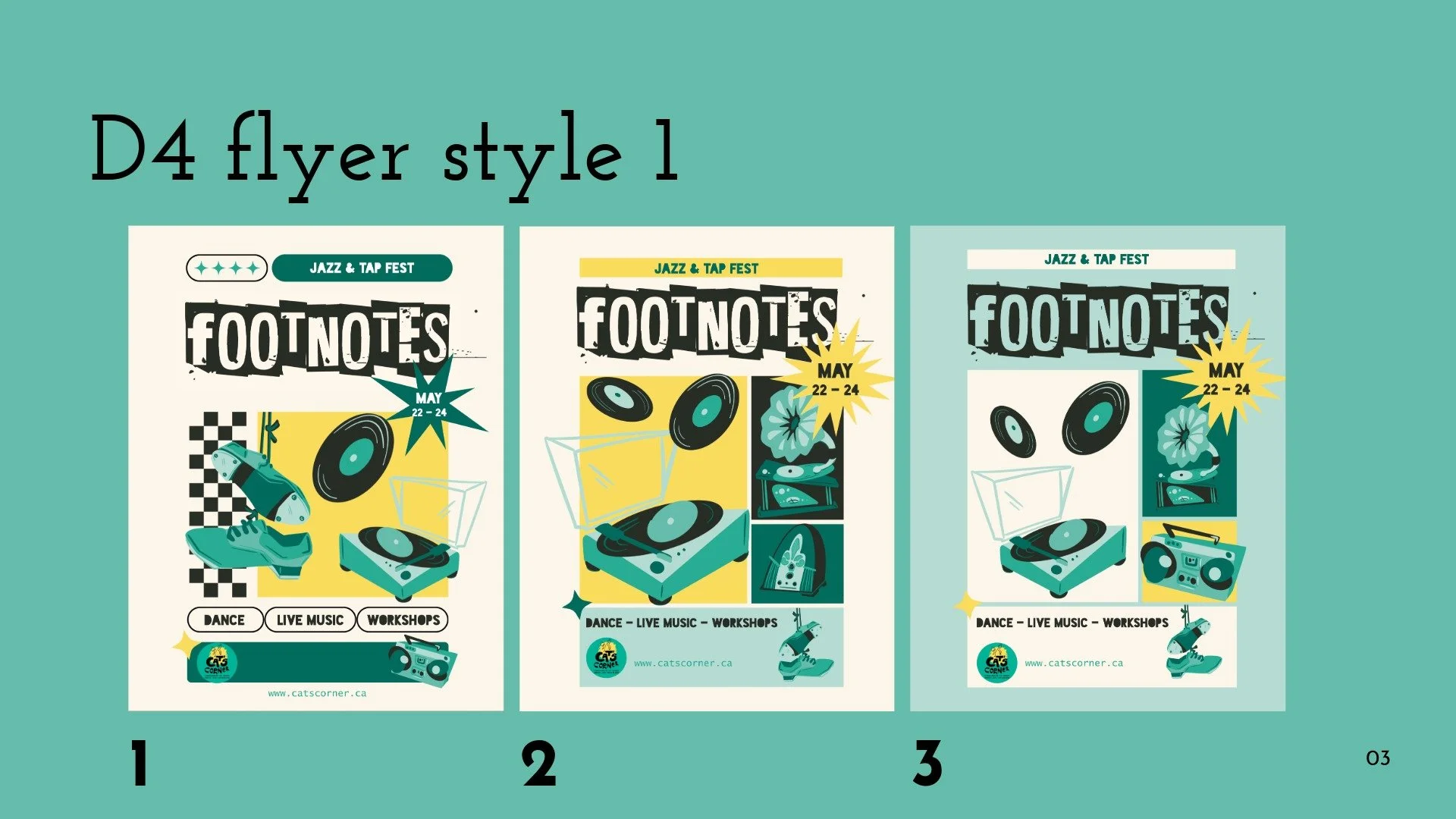
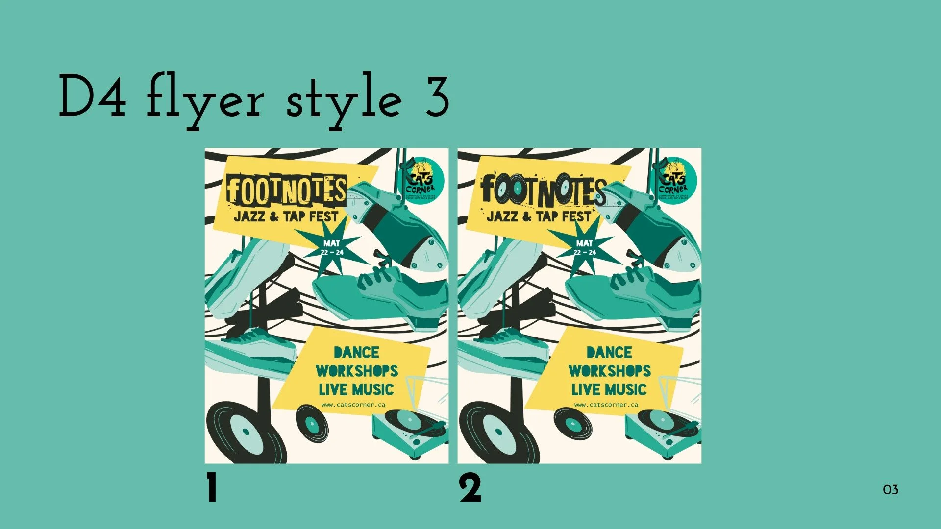
Incorporate this into a flyer format
Feedback - round 2
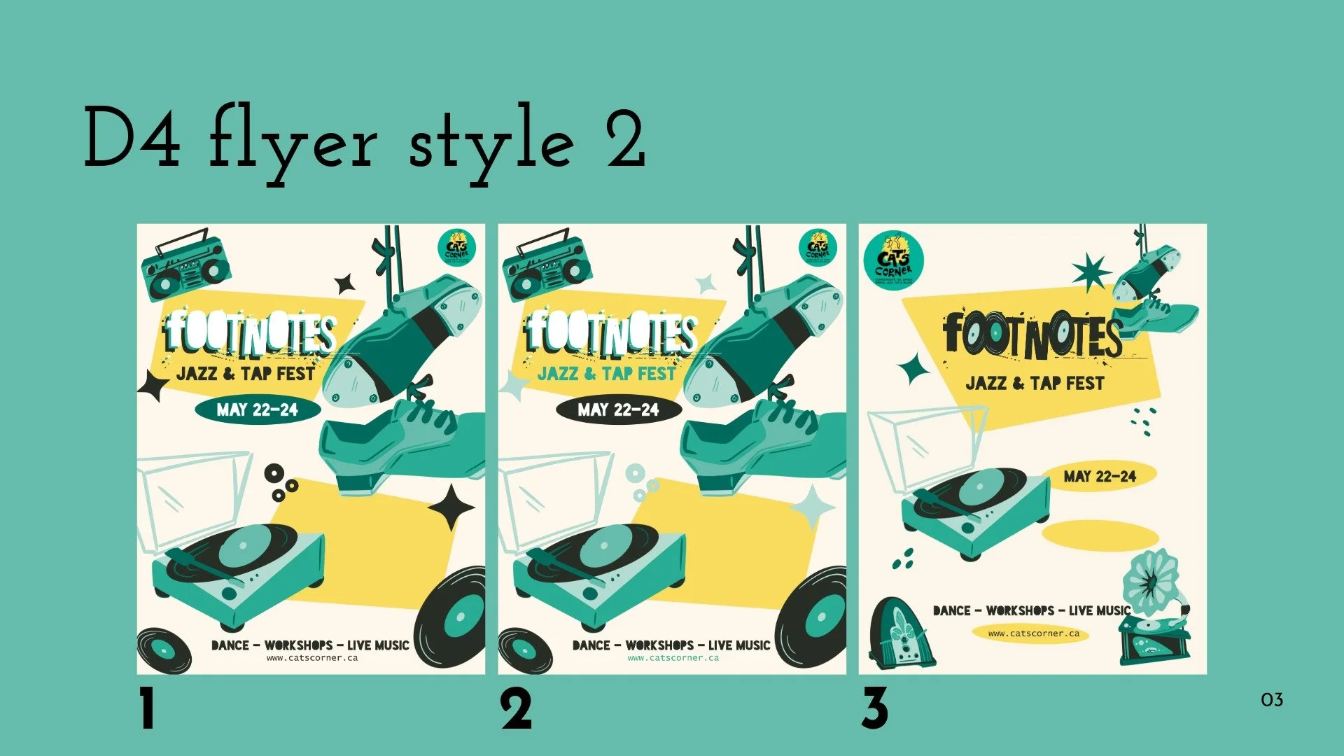
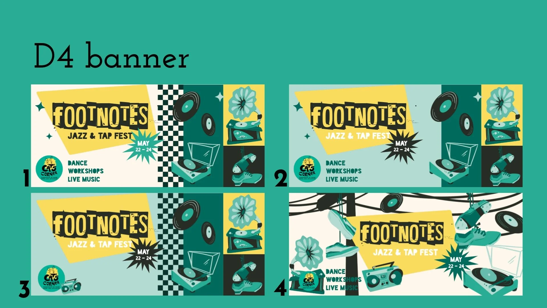
Clients narrowed down the flyer and feeling for the branding at this point, choosing a flyer option that was closest to what they were looking for. I balanced both the Cats Corner colors and darker blues so that the palette felt more collected.
Requests:
Change color options for a deeper feel
Remove checkers from banners to get away from 50s retro vibe
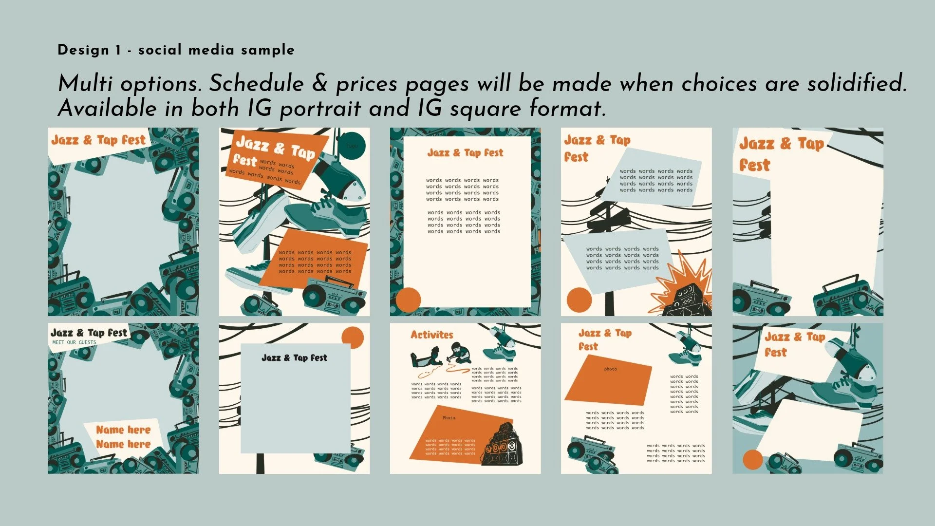
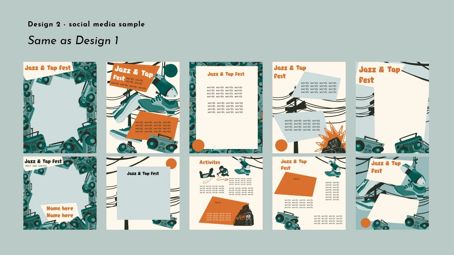
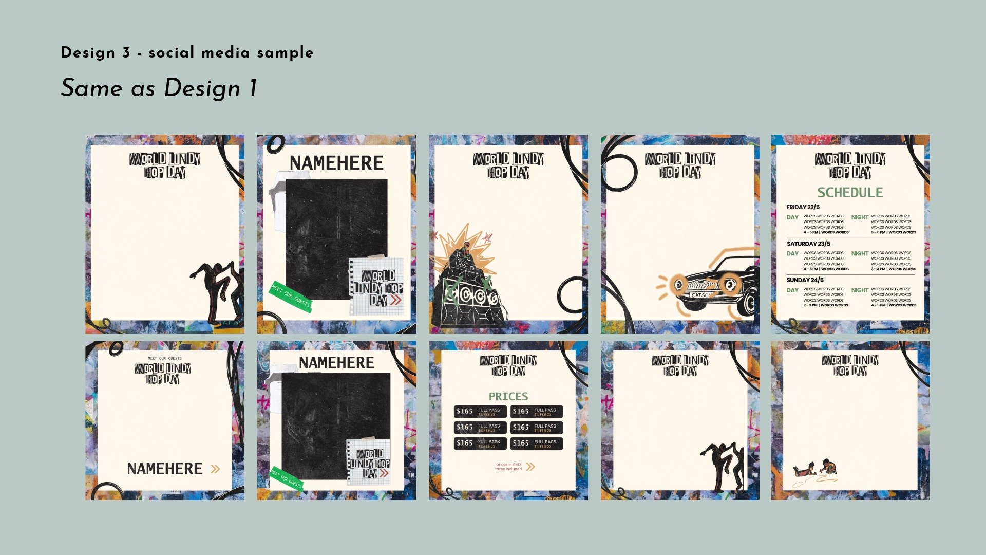
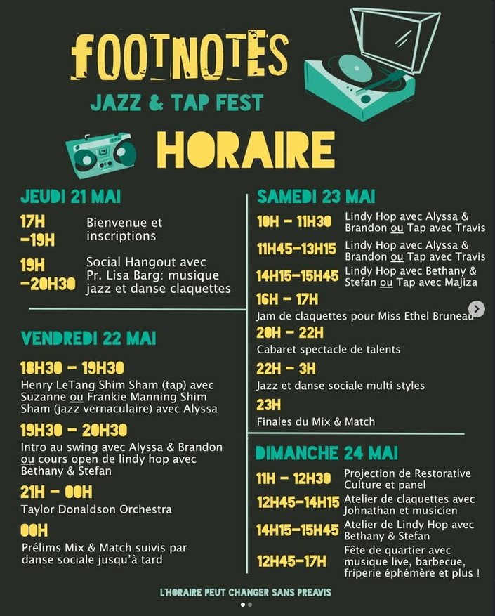
Create frames for Instagram posts and instructor announcements
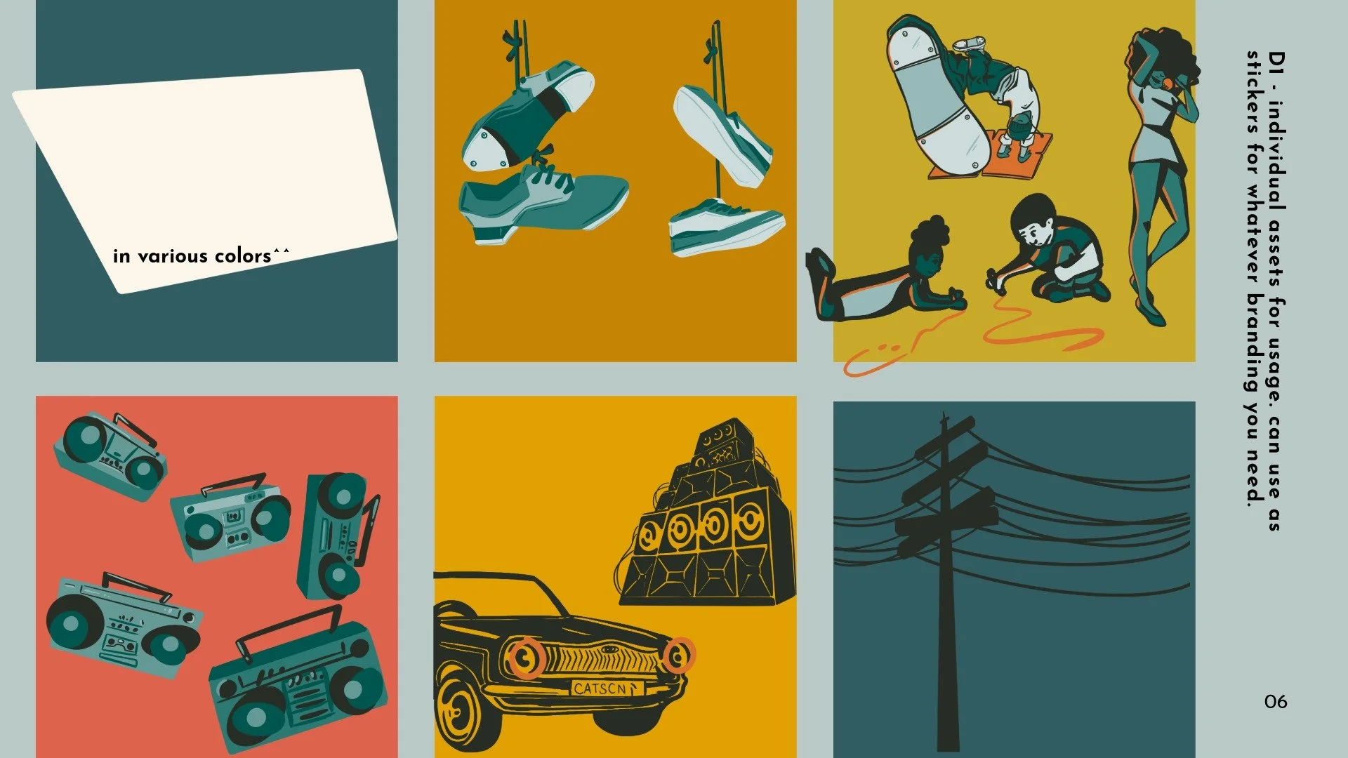
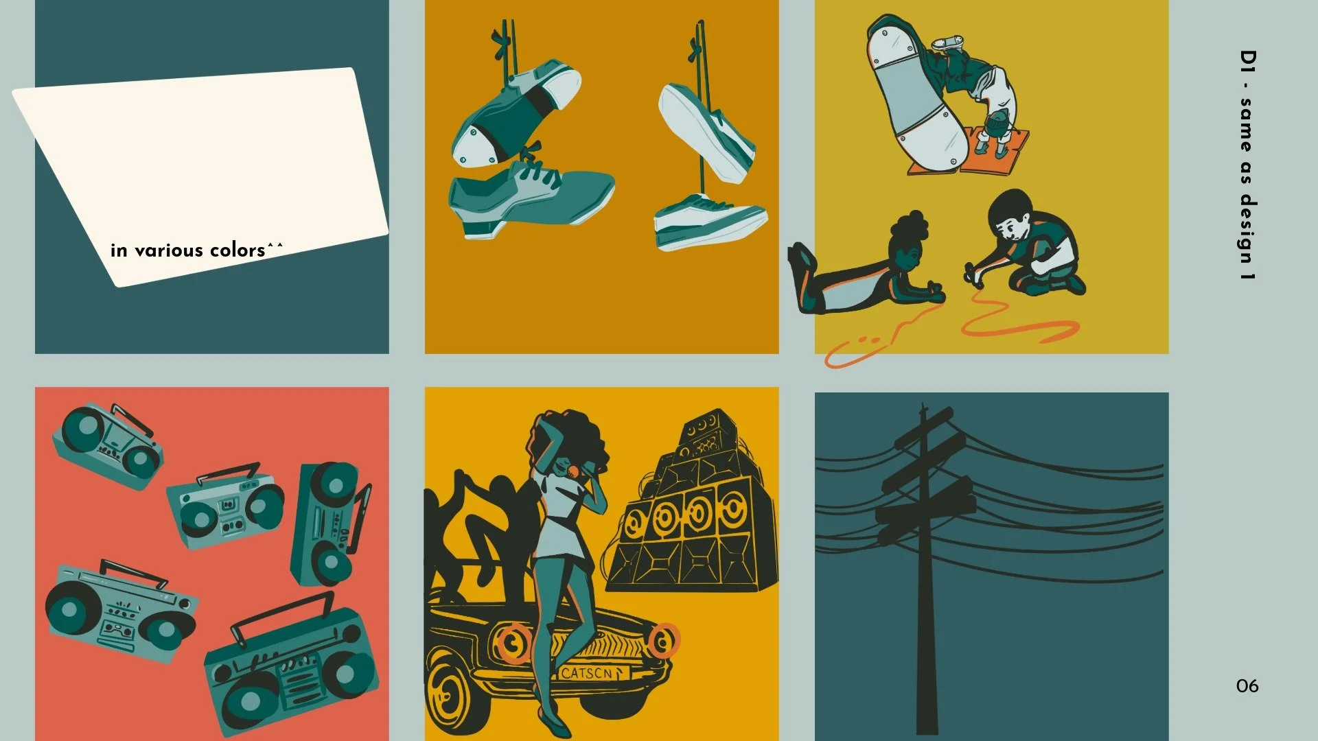
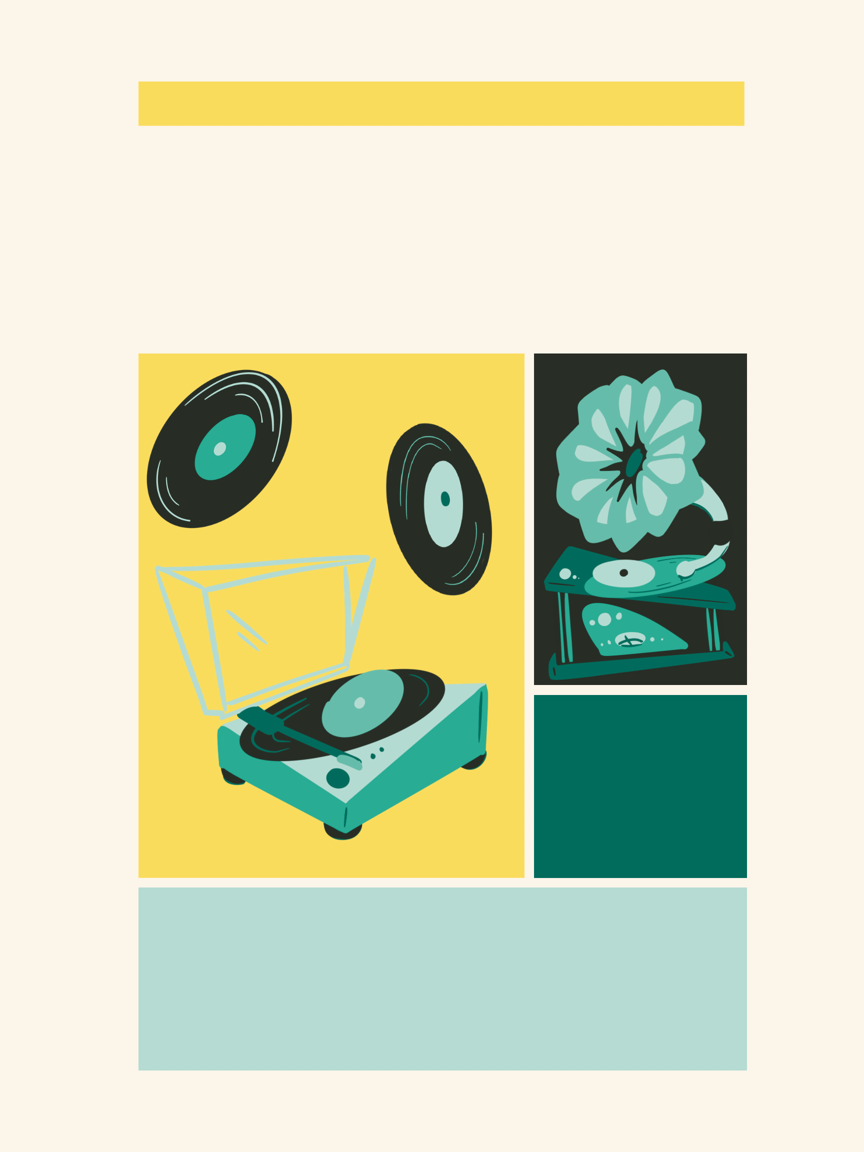
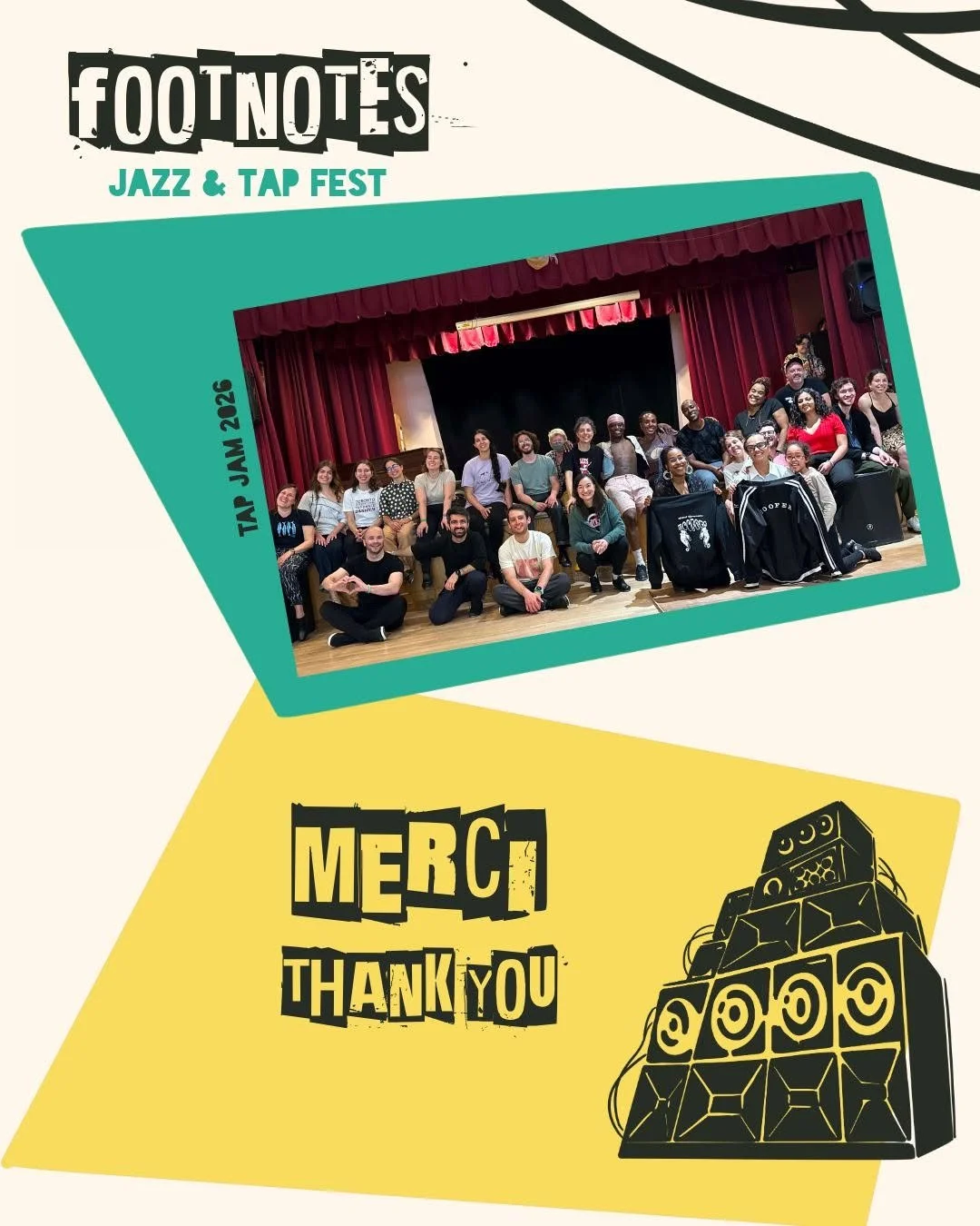
Keep assets from previous design to be used in the booklet (diva singer, car, speakers, kids coloring)
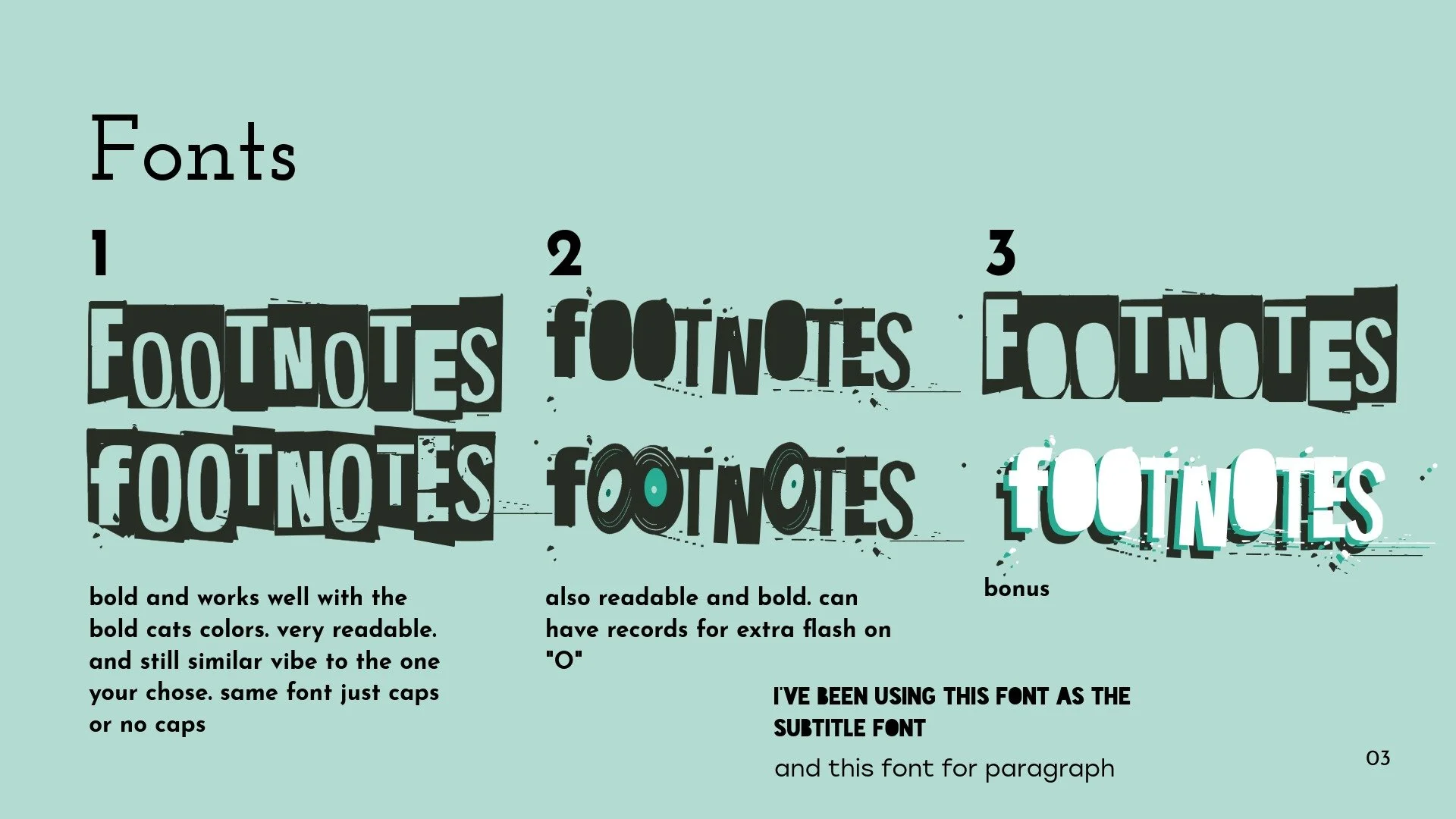
We decided between 4 different font variations as well
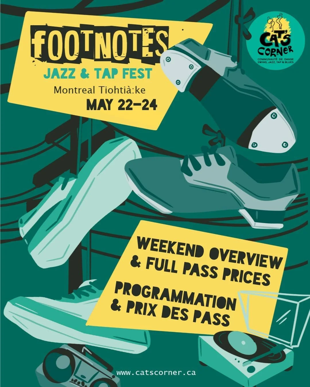
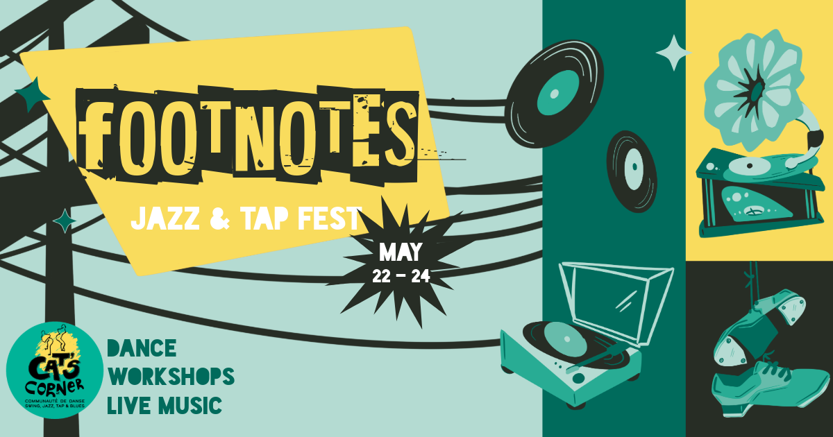
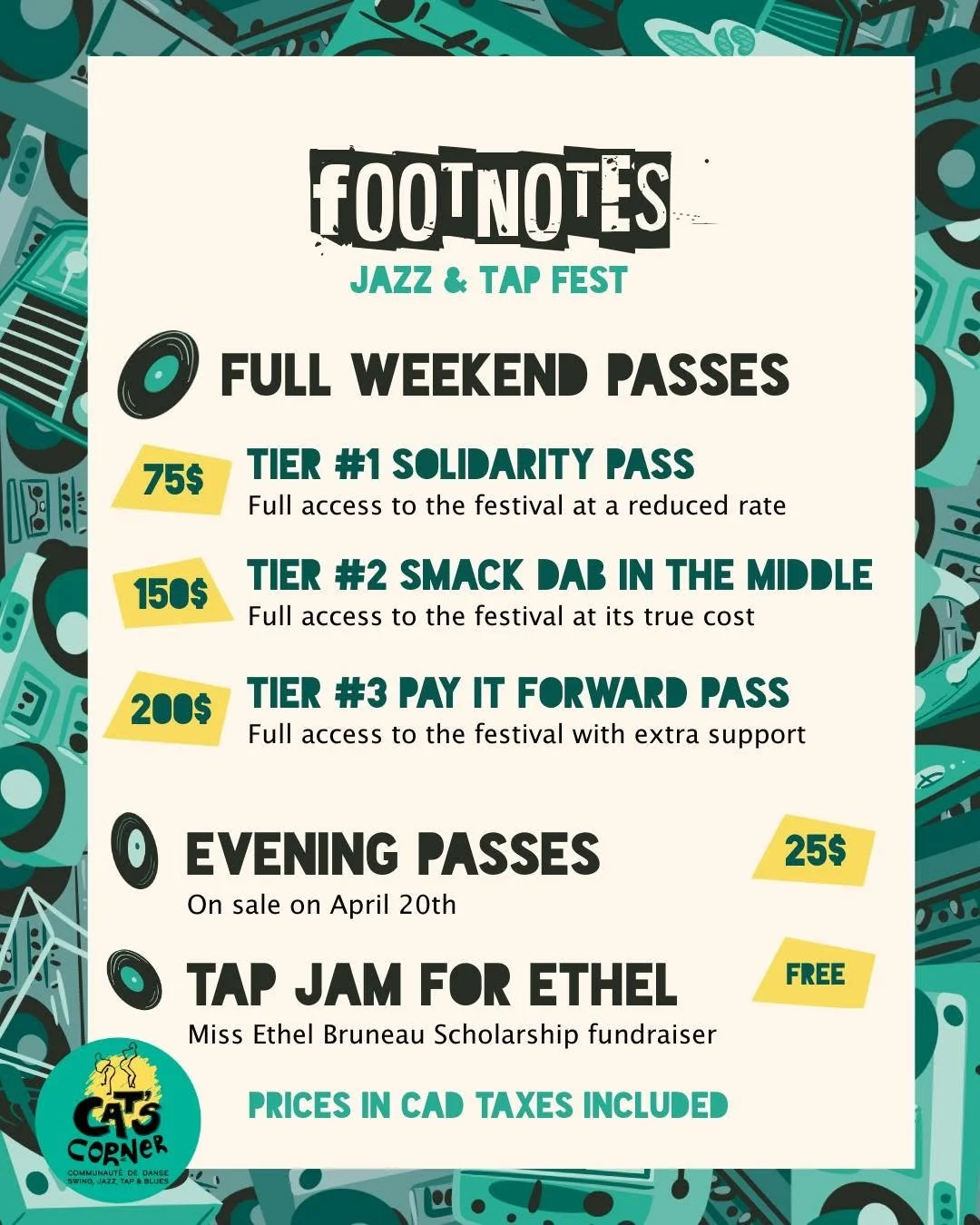
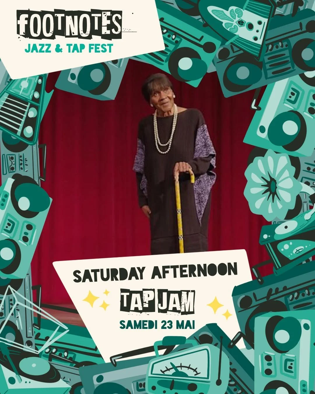
Final Design
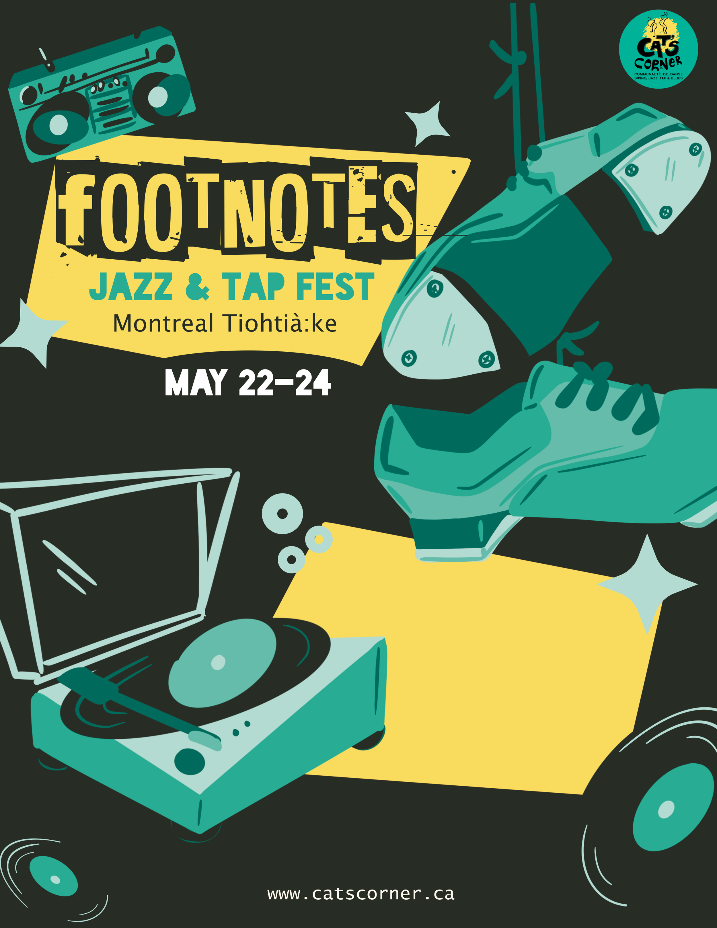
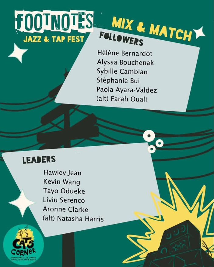
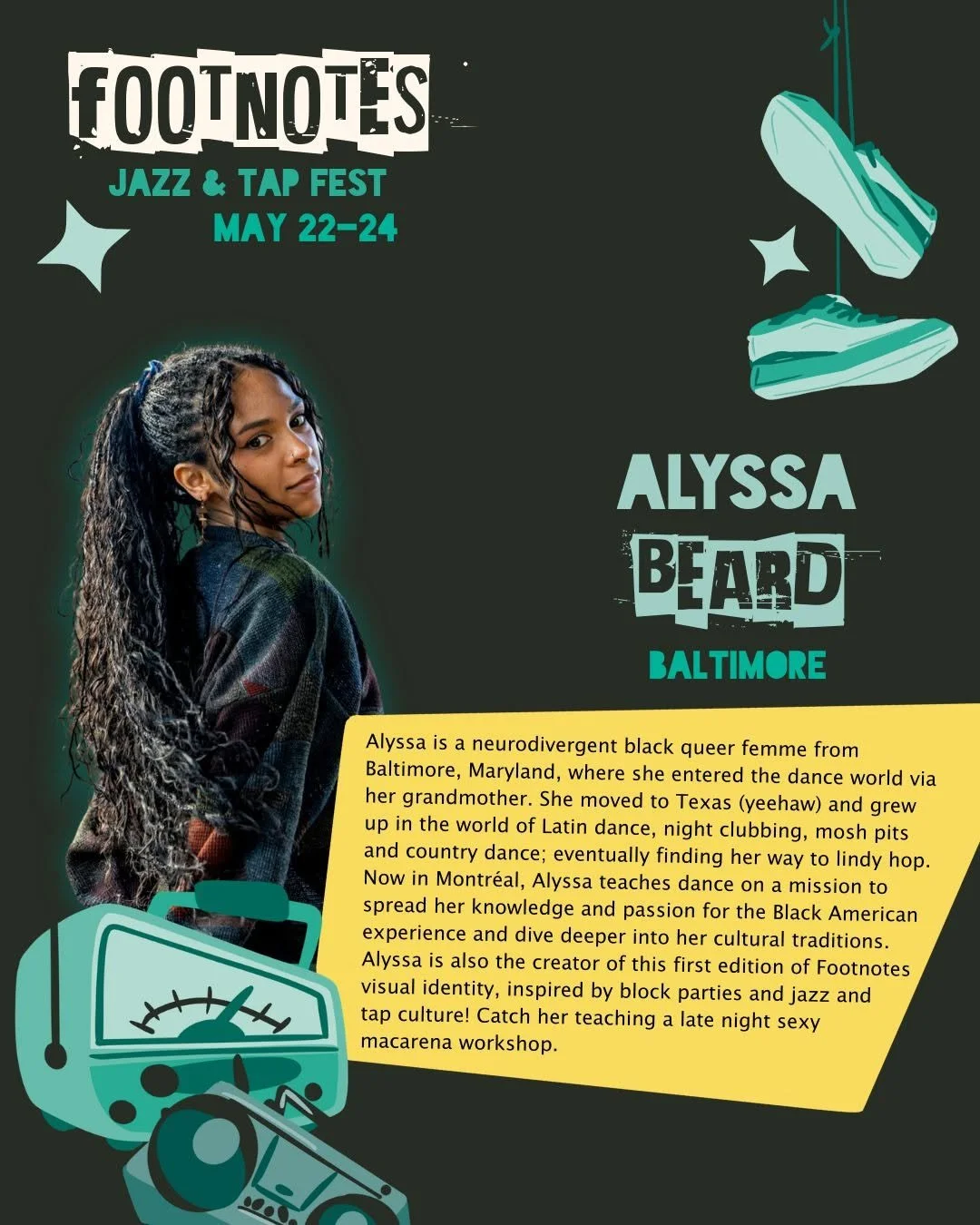
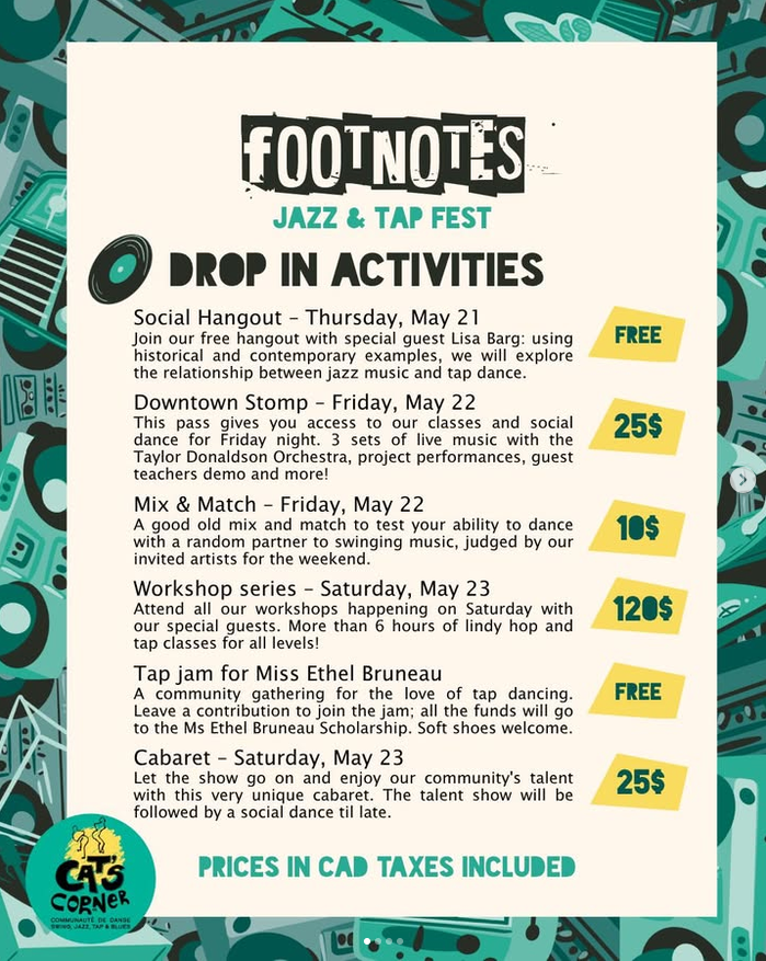
Over 20 final assets were delivered for Cats Corner: the main flyer, A booklet with over 20 page variations, an Facebook banner, over 10 Instagram frames, 2 fonts, a color palette, and over 15 individual assets. Additional fun variations of the flyer, were also provided for flexible use.
Final Assets
Reflection
What I Learned
Assets over composition
Providing assets over a full illustrated composition allowed the client more flexibility over their branding and design usage.
Fonts!
Fonts can really make or break the vibe of your design. Finding the right font and making sure it is commercial use is crucial.