

Flurry Festival
Flurry Festival is a long-running, community-focused music and dance festival held every February in Saratoga Springs, New York. It’s one of the largest folk-dance and live-music gatherings in the U.S., bringing together thousands of dancers, musicians, and enthusiasts for a full weekend of nonstop social dancing, workshops, and performances.
Role: Graphic Designer, client communication
Project Context: Festival Organization
Product Type: Logo, Social Media Banner, Merchasndise
Duration: 2 months, May-July 2025
Tools: Figma, Procreate, Adobe
Problem
The Flurry Festival is seeking branding materials that reflect the large variety of dance styles, multigenerational atmosphere and live music. They need a logo and design that captures the spirit of the festival, along with adaptable social media icons and post banners that can promote the event consistently across platforms. They want a fresh new design that is different from what they have used before.
Solution
To represent The Flurry Festival, I’m exploring designs that convey a sense of “warmth” to contrast the consistent representation of cold weather for their event. Clients asked to incorporate foot or dance-inspired elements, with diversity to highlight its wide variety of attendees and types of dances being represented. The client states that the goal is a cohesive visual identity that’s vibrant, clear, unique, art that tells a story.
Style Guide
For this project I provided the client with a style guide to give references of multiple designs and options in one file. This allowed the client to view the designs side by side, while also giving context to the design decisions and possible directions we could take them.

Feedback - first round
Clients loved both designs and ultimately wanted to combine the two somehow.
What they liked from each design:
Design 1: Warm, folk feeling, lighting contrast
Design 2: Focused on the community aspect, More urban aspect they haven’t explored before, brings in the city element
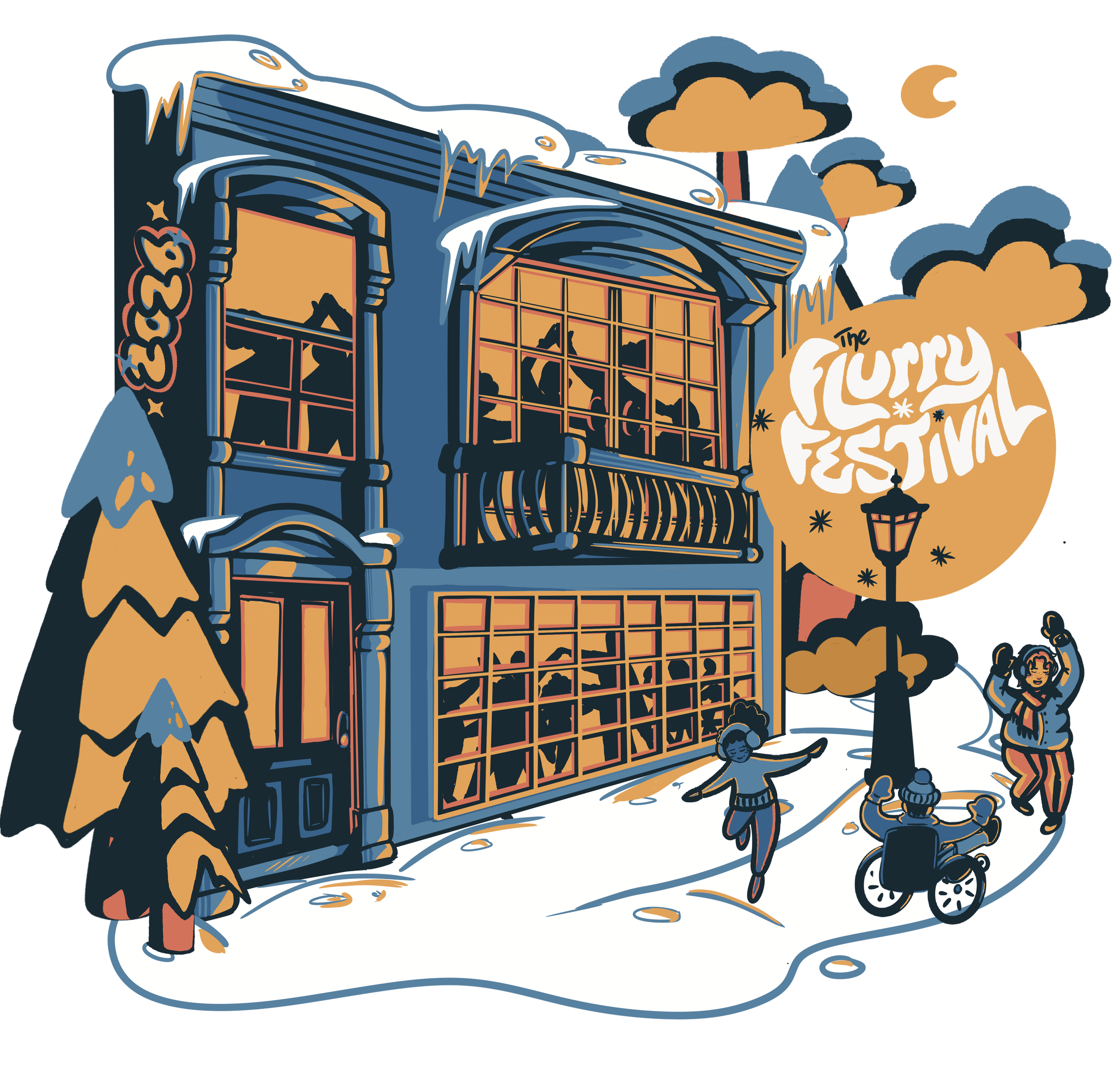
Feedback - round 2
Clients wanted to focus more on design 2 and take away the elements from design 1 after all. So we focused on the urban elements.
Requests:
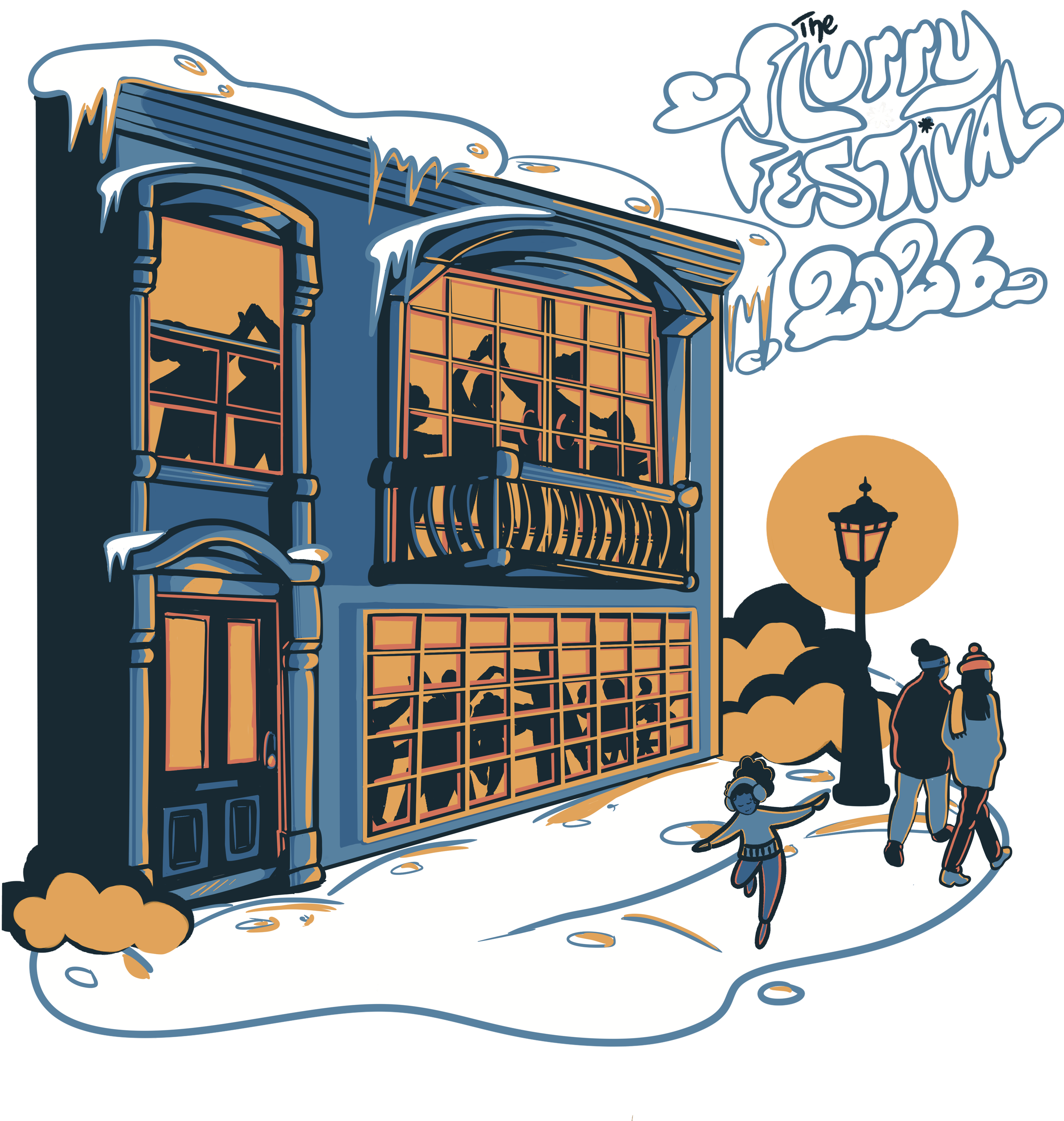
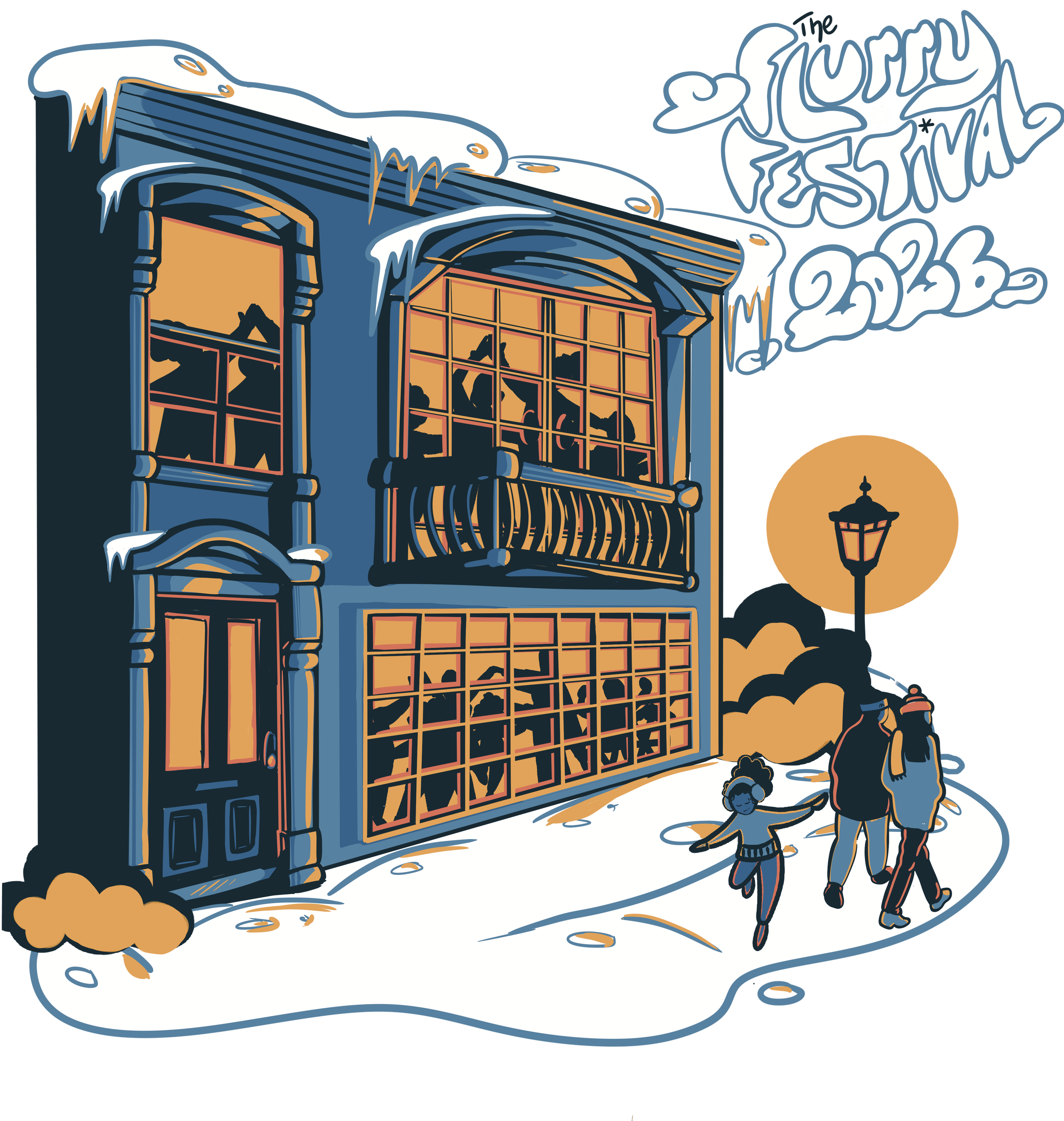
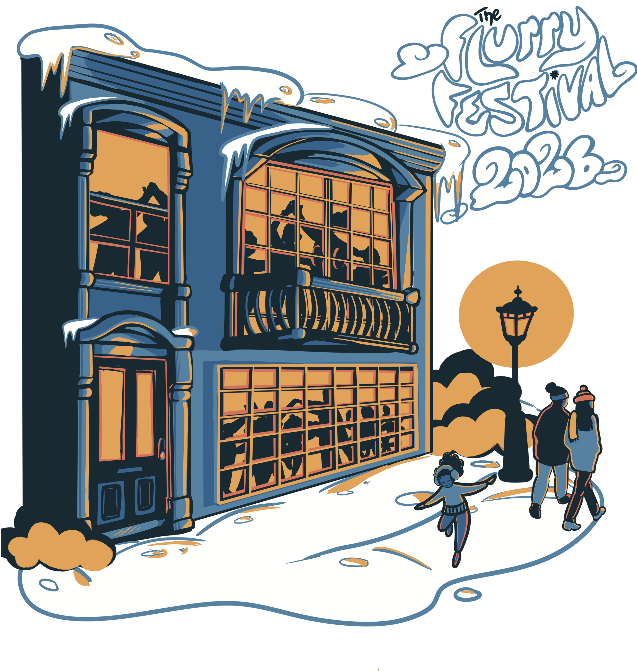
two different designs for the flyer and the t-shirt now so we can have the event name and year as a focus for the flyer
keep people outside to show the connection between two locations they use for the event
Add more people indoors
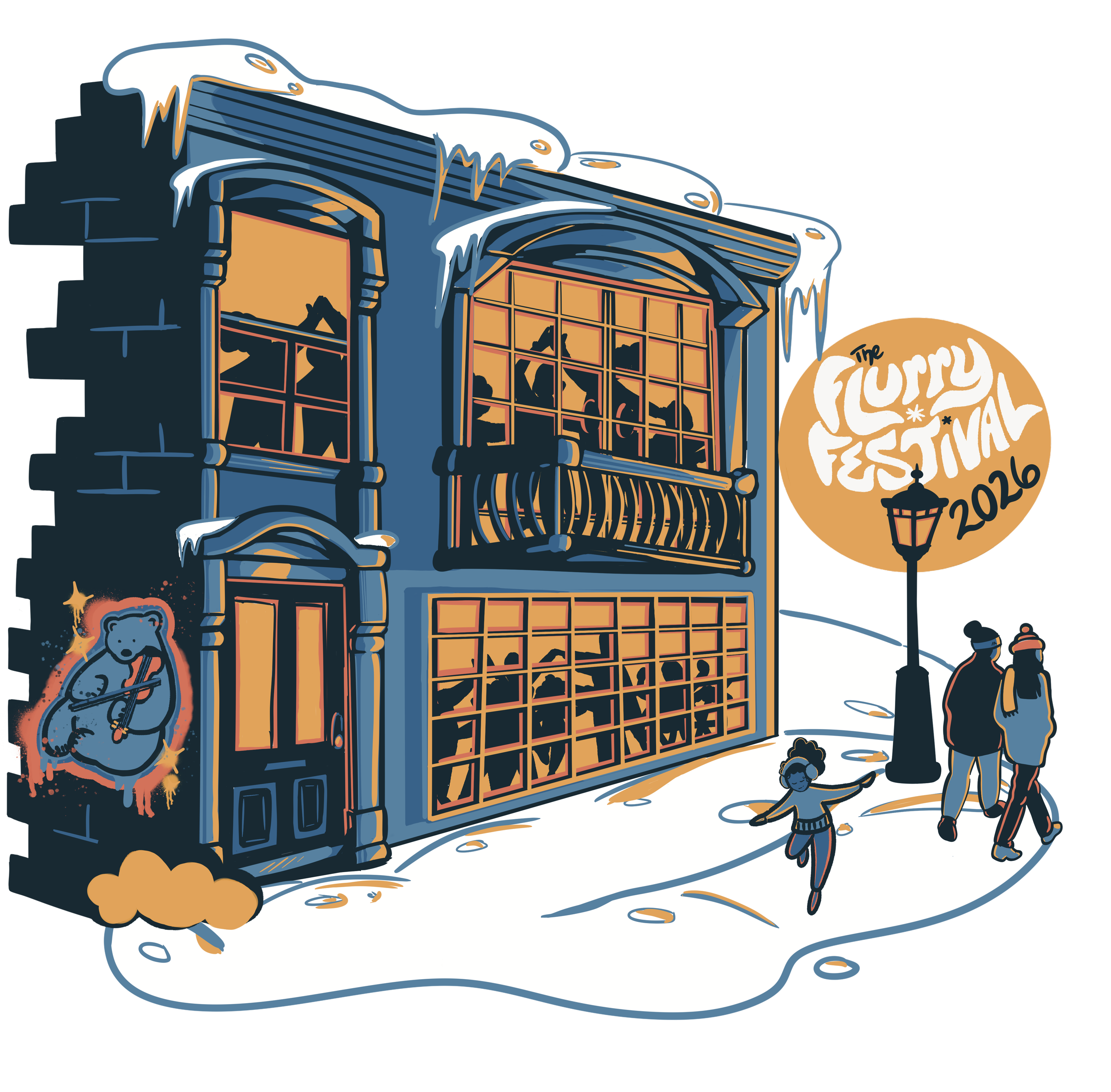
Shift the logo to the blue from design 1
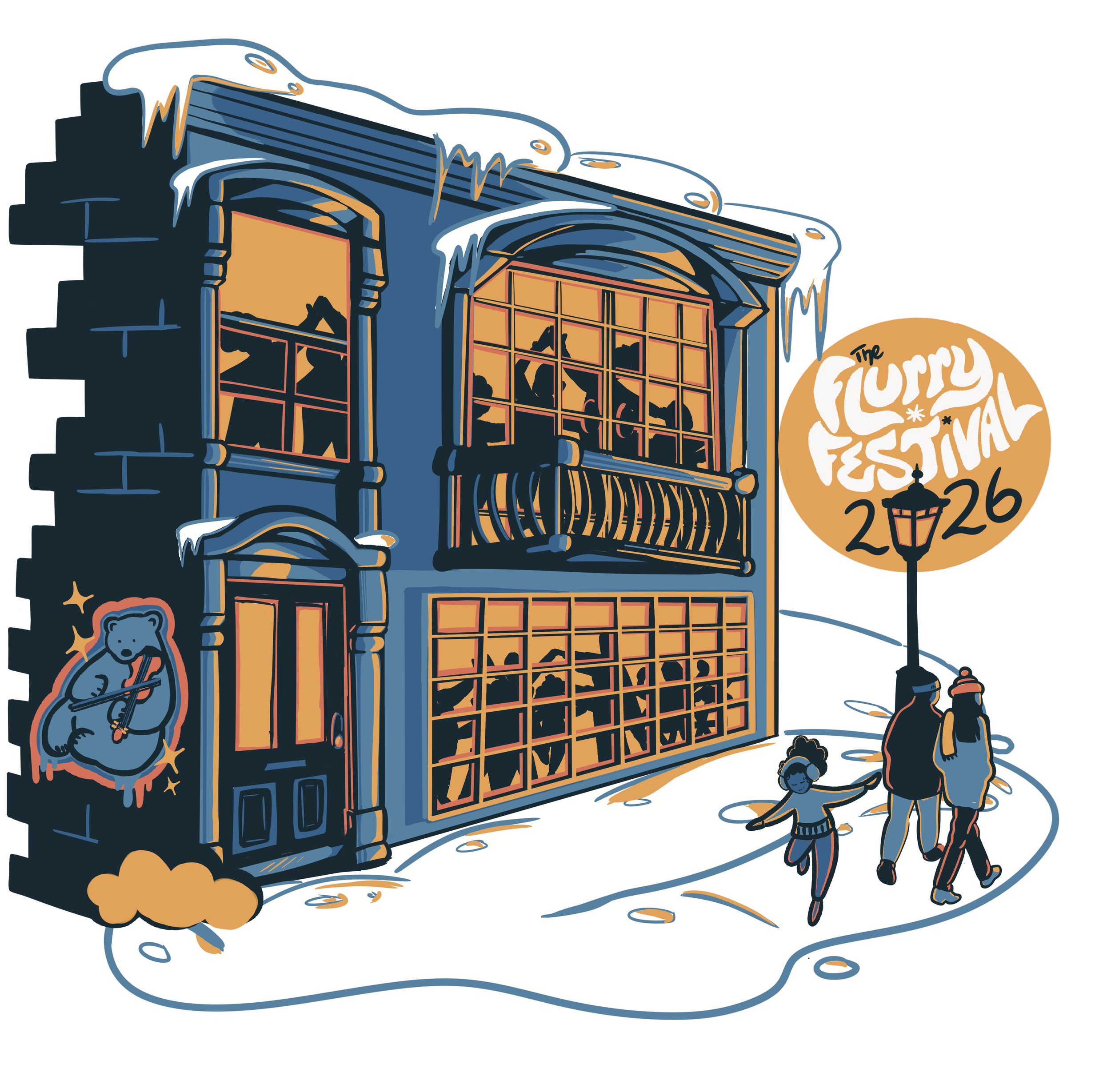
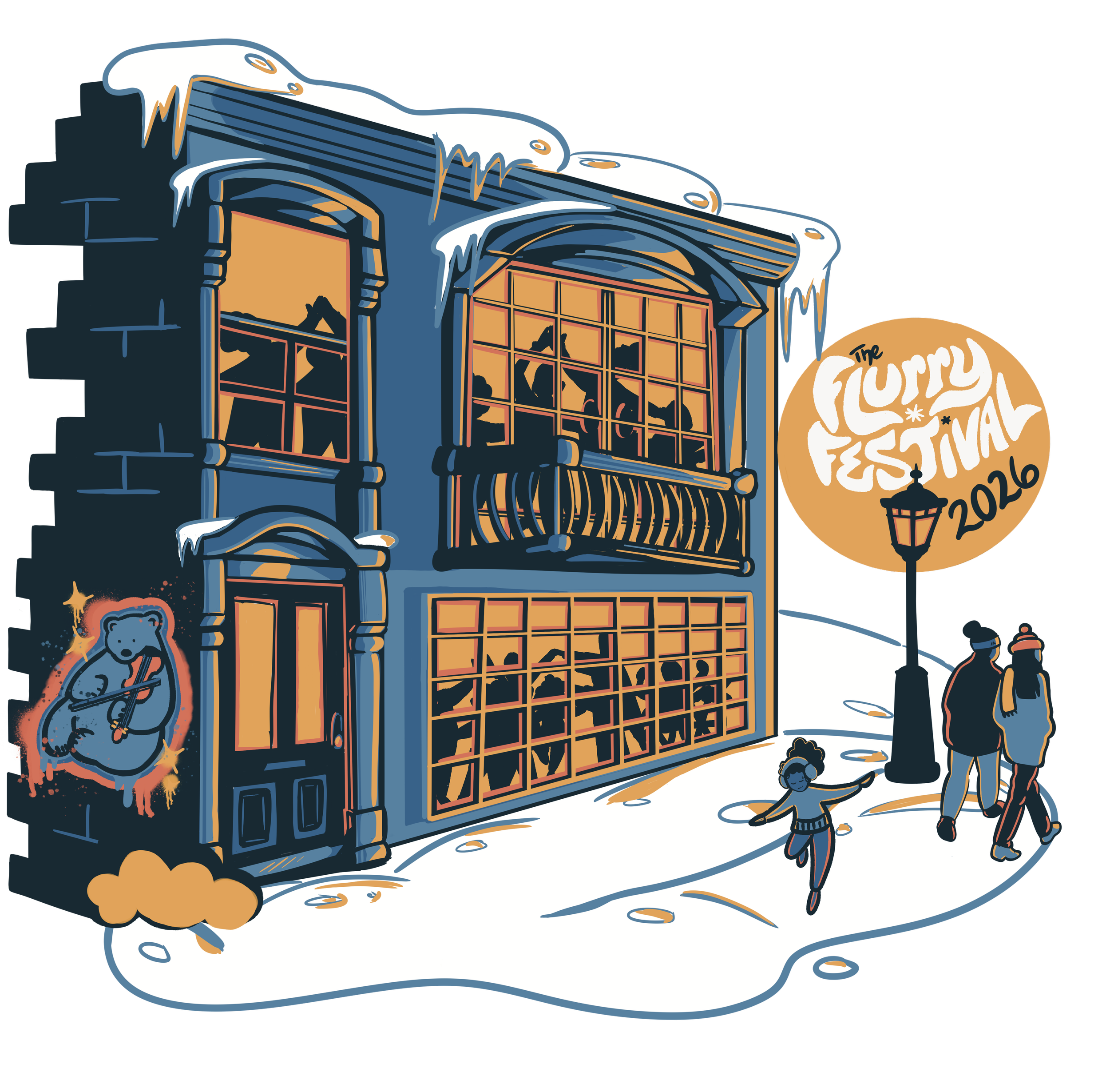
Add a tagged Polar Bear with a fiddle Easter egg (return participants loved having a Polar Bear Mascot for their T-Shirts)
Keep left side flat for flyer, add brick detail for T-shirt
Final Designs
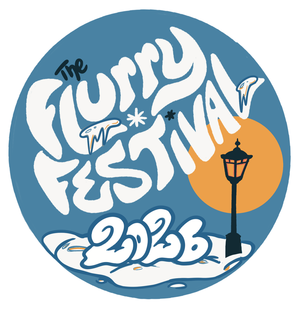
4 Final Assets
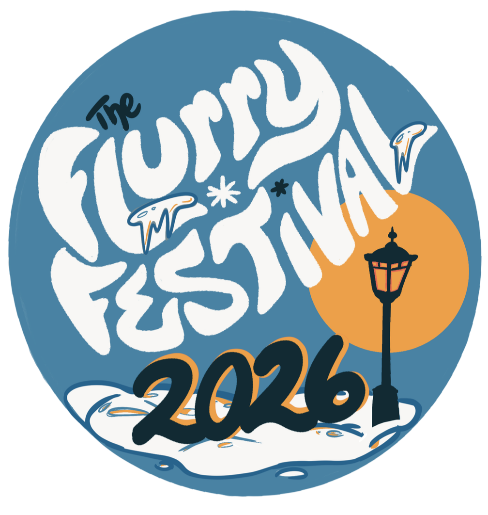
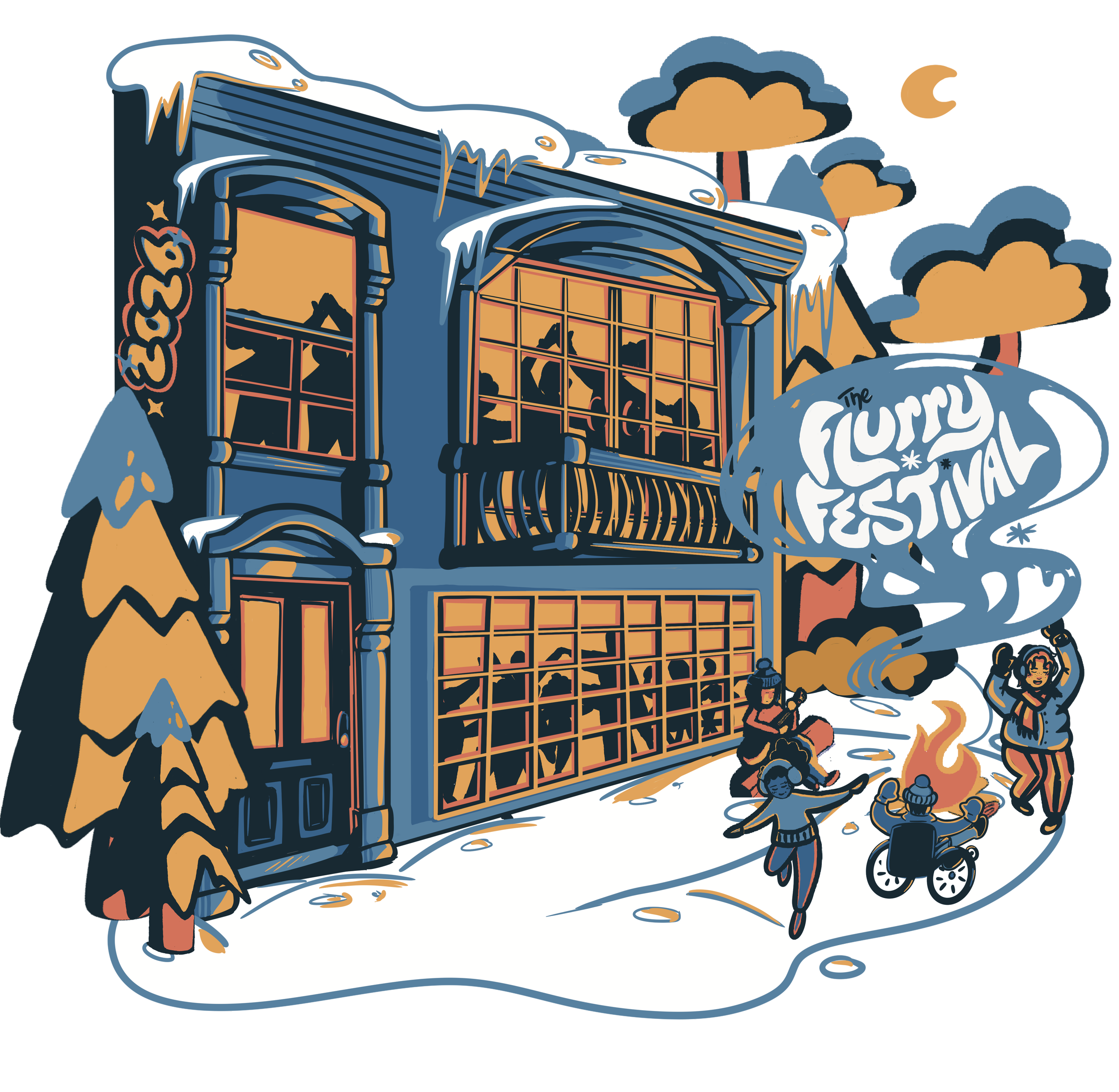
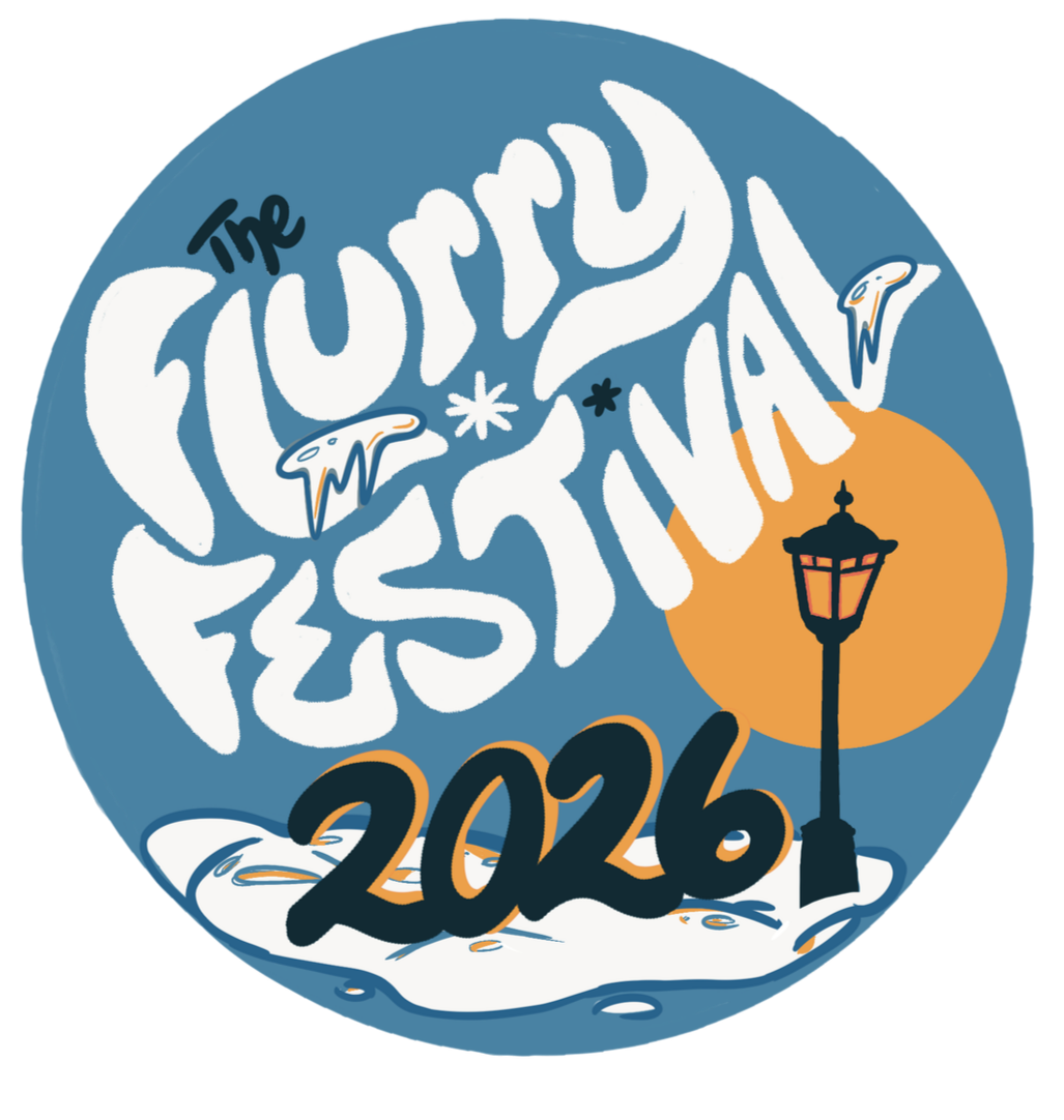
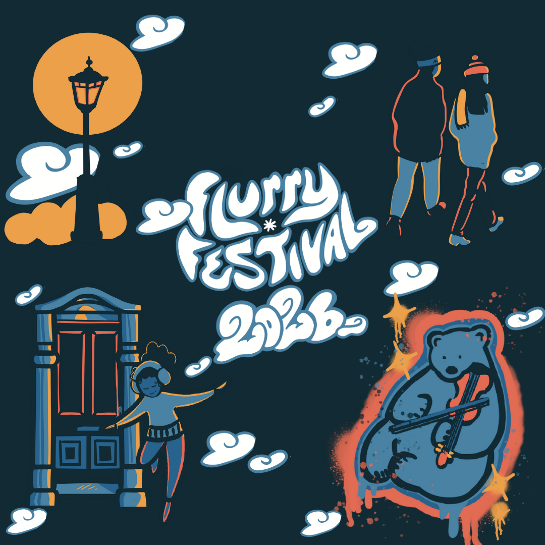
Four final assets were delivered for The Flurry Festival: the main logo, A Flyers with a more prominent title, A T-shirt design with a Polar Bear and brick detail, and a repeating banner for social media and website use. Additional fun variations of the banner, were also provided for flexible use.
Reflection
What I Learned
Color Contrast
When given a limited color pallete for a large project, using contrast and color lighting is a great option to still show depth.
Style Guides
Creating a style guide for the marketing team to review together was a huge help. When dealing with a big marketing team, sometimes it’s easier to provide a document that can be reviewed asynchronously outside of meetings so decisions can be made clearly.